Debranding Is the New Branding
From Burger King & Toyota to Intel & Warner Brothers, major brands are discarding detail and depth. Why now, and what’s the rush?

(Bloomberg Opinion) -- In recent years many major brands have taken a long, hard look in the mirror and hit reverse — discarding detail and depth to debrand.
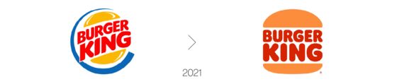
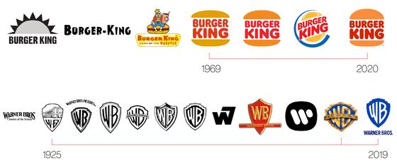
Burger King returned to a simpler, flatter identity:
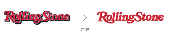
Rolling Stone shed its character stroke and drop shadow for a cleaner edge:
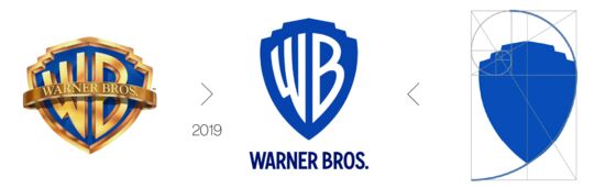
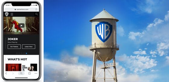
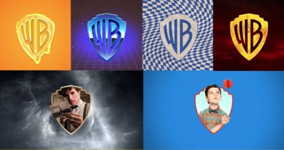
Warner Bros. stripped back the gilt and elongated its shield via the Golden Ratio:
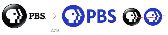
America’s Public Broadcasting Service lost its serifs and button-like sheen and (somewhat haughtily) up-turned its nose:
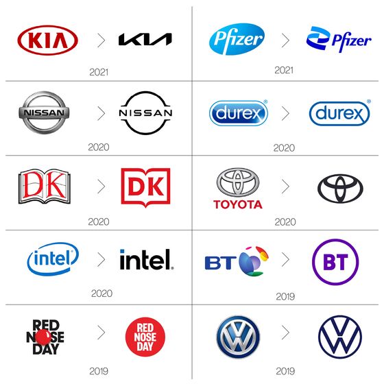
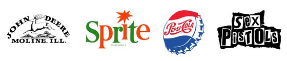
And the examples keep coming:
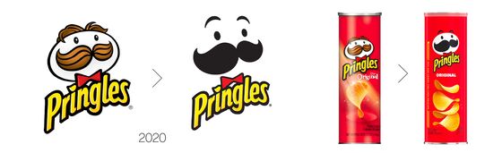
Even Julius Pringle had a flattening make-under with shaved head, dyed moustache, dilated eyes and new pre-sprung eyebrows which presumably indicate bafflement that, although he keeps his bow tie, he still lacks a mouth.
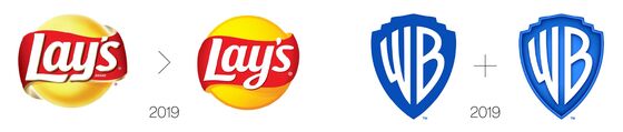
Of course, debranding need not be absolute, simplistic or dull. For instance, Lay’s retained some of its earlier shading and depth, as did Warner Bros., which has a bonus dimensional version “for on-screen content and special cases.”
And Kia’s new streamlined identity was unveiled with … [checks notes] … 303 firework-spewing “pyro-drones.”
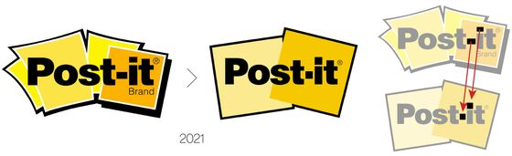
A tad less flamboyantly, while the Post-it debrand discarded the company’s cartoon energy (and eliminated the word “brand”), it added a pleasing design detail: replacing the oblong hyphen and squat “i” dot with Post-it-note-appropriate squares.
* * *
So far, so simple. But why have so many companies decided to debrand?
There are several interlocking explanations.
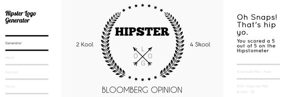
Hip to be square · As much as brands aspire to be sui generis, branding has fashions that ebb and flow like skirt lengths or collar widths. This was as true of “jazz age” and “flower power” brands as of the recent effusion of “hipster” brands — a trope that became so hackneyed some wisenheimer coded a Hipster Logo Generator:
Time will tell if these little-black-dress logos last, or whether fashion reverts to detail, complexity and personality. After all, once a critical mass has “zagged” against a prevailing “zig,” the margin becomes mainstream, the template flips and the dance begins afresh.
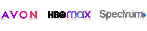
Honey, I shrunk the logo! · Advertising’s oldest cliché has the client asking: “Can you make the logo bigger?” But the internet has forever constrained the dimensions of design. In a pre-Web world — when the smallest canvas for many brands was the business card — intricacy could be embraced. Nowadays, corporate identities must “click” inside an ever-expanding warren of tiny boxes, from 120-pixel iPhone buttons to 16-pixel browser “favicons.”
The difficulty of ensuring that any logo (let alone an intricate, dimensional logo) stands out from the kaleidoscopic eye-candy of ads, apps and open tabs is one driver behind “mobile first” design. Here identity and functionality are conceived from the outset inside the tightest constraints — for what works on a cellphone will surely work on a water-tower.
Such pixel-fixation is table-stakes for modern startups, but legacy brands must be canny when reverse-engineering decades of brand equity into today’s digital Lilliput. The trickiness of this task explains why the Burger King debrand spent so much time and effort on its see-at-all-sizes, three-in-one monogram:
Visual Lingua Franca · That said, debranding is not only about size or, for that matter, selling. Although McDonald’s recent packaging debrand “highlights the specialness of our menu, and delivers on our commitment to quality,” it also serves (like international safety signs) a more practical purpose:
“The redesigned packaging ensures that operations remain efficient for McDonald’s’ crew members making each meal … The easy-to-understand graphics drive recognition regardless of where in the world orders are being assembled, shared and enjoyed.”

Computers revolutionized everything, and the revolution proved endless. Every significant software update enables and inspires new trends which flood the market in waves. The trained eye can easily spot the moment when novel features (such as Adobe Illustrator’s “mesh tool” or “freeform gradient”) appear in the wild. One of Illustrator’s most conspicuous innovations has been “live corners” — as Armin Vit, co-founder of the design website UnderConsideration, explains:
“Years ago making a rounded corner required, say, five steps — now it only requires one. Since you can manipulate the effect in real time, it’s inevitable that more people will use it. In principle, that’s not a bad thing as it improves a designer’s workflow and ability. But in the past decade it’s clear everyone is using the tool, and in the worst cases as a stylistic gesture without really considering what message it conveys or whether the letterforms benefit from it.”
Once you become aware of live corners, their (mis)use is impossible to unsee:
Anyone who has over-filtered an Instagram sunset knows the seductive lure of visual excess — a seduction to which pros are not immune. The ability to round corners, drop shadows, customize gradients and create complex lighting effects can easily overpower the creative brief, and often does. Indeed, it’s clear that many recent debrands represent, at least in part, a return to sobriety after a spasm of software-abetted intoxication.
All grown up · Many of our current digital giants were born in a spirit of playful innocence that bursts forth from their early branding. As these companies grew, and the stakes rose, so their identities were obliged to mature — from cartoonish to corporate, flamboyant to flat, wacky to bland — illustrating the power of debranding to professionalize. You can almost spot the funding rounds:
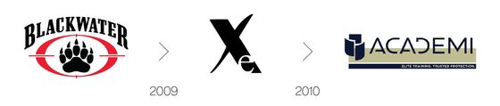
New logo, who dis? · Radical rebrands have long helped companies to escape a commercial cul de sac when an identity becomes limiting, troublesome or toxic. Sometimes a clean break is the only option — say, when your products are tarred with the brush of cancer, or your contractors slay innocent civilians.

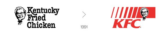
But not all threats require such comprehensive camo. In 1991, swimming against a riptide of nutritional awareness, Kentucky Fried Chicken was under pressure “to reduce dependence on the word ‘fried’.” Rather than jettison 40 years of brand equity, the company debranded to its initials.
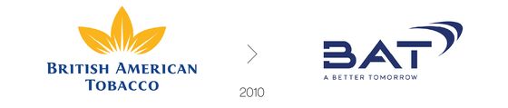
Last year British American Tobacco attempted something similar by debranding to B.A.T. — an acronym that not only concealed the word “tobacco” but contorted it into the dazzlingly cynical tagline, “A Better Tomorrow.”
In 2018, Weight Watchers shed 6/7ths of its bulk to become WW — a much-mocked debrand that the company’s chief executive insisted stood neither for “Weight Watchers” nor “Wellness that Works” (a trade-marked tagline), but was merely a “marque [that] represents our heritage and history and what we are going forward.”

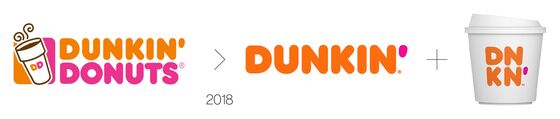
More successfully — “as one of many steps to transform itself into the premier beverage-led, on-the-go brand” — in 2019 Dunkin’ Donuts dunked on its donuts to become simply Dunkin’.
Although debranding is clearly useful when the march of time renders your identity anachronistic …
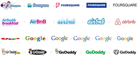
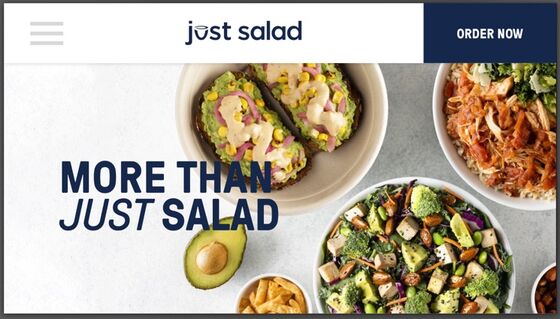
… some companies revel in their brandtiquated status: 7-Eleven stores are “generally open 24-hours a day”; most Airbnb hosts offer neither airbeds nor breakfast; Britain’s Carphone Warehouse doesn’t sell carphones and isn’t a warehouse; and the coffee brand Chock Full o’Nuts has never, in its 95-year history, ever contained nuts. It’s not entirely clear what Just Salads is up to:
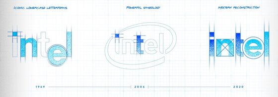
Flat to the future · If they don’t have carte blanche for a blue-sky redesign, designers love to pore through an archive — after all, what’s the point of “brand heritage” if you can’t “build upon it”? For brands with a history, redeploying elements of legacy identities inspires confidence, maintains continuity and allows decades-old companies to straddle the past and the future. As Intel claimed of its 2020 debrand: “Simultaneously nodding to our heritage and leaping boldly into what comes next, our new visual identity emanates a renewed sense of confidence and simplicity.”
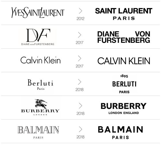
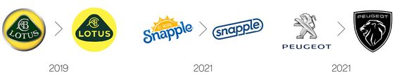
Similar retrospection can be seen in two of the largest recent debrands:
Just as (once upon a time) “no one got fired for buying I.B.M.,” evolutionary debrands are significantly safer than revolutionary rebrands — a design truism illustrated by two very British disasters. In 1997, British Airways abandoned its patriotic flag and crest livery for “50 images representing examples of ethnic art from across the world.” Few were impressed, most famously Margaret Thatcher who took matters into her own hands:
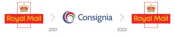
Although most of these multicultural tailfins were repainted within a couple of years, B.A.’s rebrand lasted longer than the 2001 reimagining of Royal Mail as Consignia — a £2 million act of vandalism against a 500-year-old brand that took just 16 months to reverse:
Space portals · Flat and debranded identities can also become portals for the projection of an infinite range of messages and moods. Such flexibility is especially useful for brands spanning multiple genres (movies studios), those with a range of offerings (food companies), and those that aspire to hands-on consumer engagement (political campaigns).
Some brands are designed as portals; others debrand to exploit the portal potential.
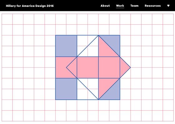
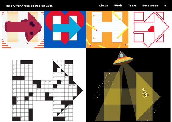
Hillary Clinton’s 2016 presidential campaign used a flexible “H+arrow” which, according to Hillary for American Design, represented “the strength of our candidate and her dedication to ensuring a better future for America,” and “allowed for endless variations and expressive interpretations.”
The Warner Bros. debrand allows the studio to incorporate its identity into movies (and merch) with wildly different themes:
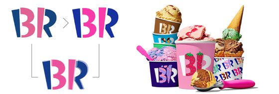
And the subtle Baskin-Robbins debrand saw the iconic “BR/31” symbol opened up to become “a canvas for flavor expression. A dynamic system of limitless possibilities showcases the wide variety of eclectic flavors offered.” In other words, a portal.
As capitalism becomes ever more synergistic, collaborative, interactive and agnostic, so corporate identities must be open to anything. (Who could have predicted Slack sneakers by Cole Haan, Kodak’s pivot to crypto, or Supreme Oreo cookies?) The nimblest new brands anticipate such plasticity from the get-go. But for legacy brands, hacking back the undergrowth helps them pivot to change, just as smoothing away unsightly lines keeps them looking young.
* * *
What, then, is debranding’s future?
Two options loom: Either the debranding trend proves ever more pervasive and, driven by digital, beds in for the long-haul; or it provokes a backlash of pent-up creativity inspiring flamboyant counter-cultures like Dada, psychedelia and punk.
There is, however, a third way — one that builds on the power of debranded portals.
Of which more in the next column.
Although this slimline ident eliminated the stigma of “weight,” and the scrutiny of “watcher,” many noted that “WW” has twice the syllables of “Weight Watchers” and that “double u, double u” may not be the wisest phrase for a wellness brand.
This column does not necessarily reflect the opinion of the editorial board or Bloomberg LP and its owners.
Ben Schott is Bloomberg Opinion's advertising and brands columnist. He created the Schott’s Original Miscellany and Schott’s Almanac series, and writes for newspapers and magazines around the world.
©2021 Bloomberg L.P.