This Isn’t the Flattened Curve We Were Promised

(Bloomberg Opinion) -- “Flatten the curve” has become the mantra of the global effort to contain the coronavirus pandemic. It’s a powerful and immensely valuable image, helping people understand why their sacrifices are necessary to save lives.
It’s also wrong in a crucial way: The dying won’t be over nearly as soon as it suggests.
Consider the typical charts comparing the “bad” and “flattened” curves of Covid-19 cases. They’re all symmetrical, indicating that once a population has reached the peak, the disease will taper away just as quickly as it grew. Here, for example, are the top image results of a Google search for “flatten the curve:”
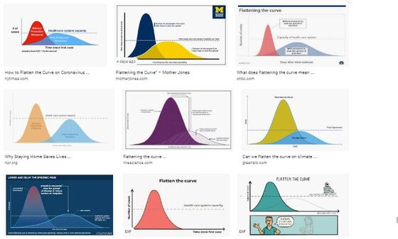
If these curves were correct, they would provide a handy formula for figuring out how long the suffering will last. Say a country is at the peak, and it has taken six weeks to get there. A symmetrical curve would indicate that it has just six more weeks to go.
Is this really happening? Let’s look at Italy and Spain, which entered the curve about two weeks ahead of the U.S. They both had uncontrolled outbreaks and turned to lockdowns too late, leading to overburdened hospitals. So they offer a decent indication of what to expect in countries that responded similarly.
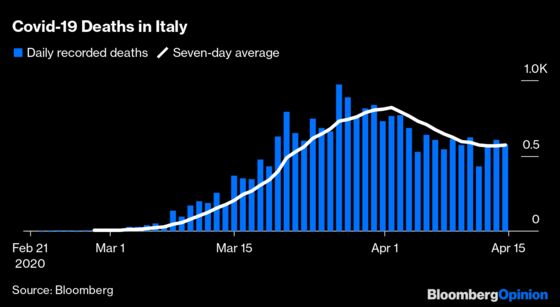
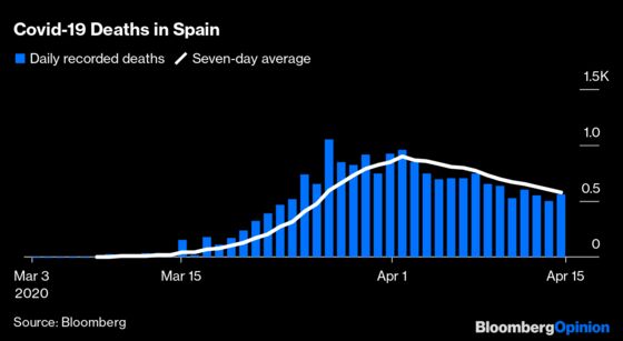
Those are not symmetric curves. They go up fast, flatten out and then descend slowly. How slowly? It’s still hard to tell, but the shape strongly suggests that the bad news won’t go away nearly as quickly as it arrived.
Now consider the U.S.:
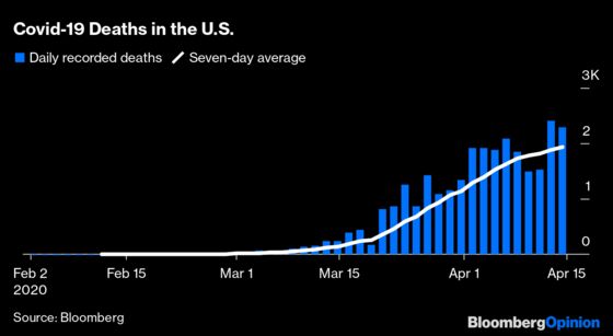
There’s some weekend noise in the daily data, but the seven-day average of deaths clearly indicates that the country has yet to reach the peak. New York State looks a bit farther along, but has yet to reach the other side:
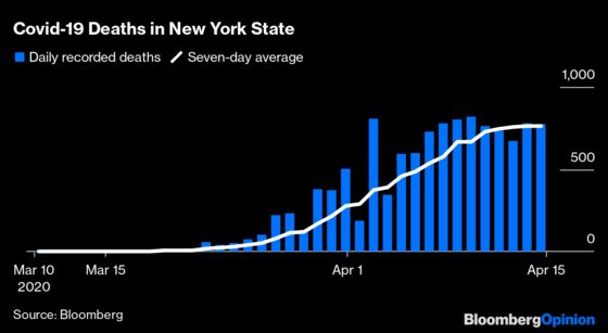
This is important. There’s no U.S. data yet on what the right side of the curve will look like, but the best available evidence from other countries suggests that the descent will be slow. New York Governor Andrew Cuomo has said “the worst is over” and “we’ve reached the peak.” He should have followed with “now comes the long wait.”
This shouldn’t be surprising. All our efforts to stay inside and separated –- except for essential activities such as shopping, and except for those who must work –- serve only to slow the spread, not stop it. If you’re hoping for the somewhat symmetrical China curve, forget it. We’re not quarantining people at gunpoint. It’s like someone took the worst-case-scenario curve and pushed it forward in time, without making the area under the curve smaller.
Here’s an analogy. Imagine a plow spreading out a big pile of snow in the street. If it keeps the blade higher, the pile will be taller and won’t spread out very far. If it lowers the blade to a few inches off the ground, the snow will be more manageable but also spread out much farther. The better it does the job – the thinner it spreads the snow -- the longer it will take.
If people stick with measures to contain the virus, death rates will eventually trickle down to zero, but only after a lot more people have been infected, assuming they are then immune. If we’re lucky, we’ll slow things down enough to never truly overwhelm the hospitals, and if we’re really lucky we’ll slow things down long enough to benefit from a vaccine or a treatment.
But short of a miracle, expect the flattened curve to be very lopsided: a quick rise at the beginning, and a slow steady flow of bad news for many months. There’s no symmetry in sight.
I recently wrote an article about flaws in the Covid-19 numbers. So you might wonder why I'm using themhere. I'm assuming that although the data are probably biased, they're biased in a more or less consistent way. So they're OK for capturing trends.
This column does not necessarily reflect the opinion of Bloomberg LP and its owners.
Cathy O’Neil is a Bloomberg Opinion columnist. She is a mathematician who has worked as a professor, hedge-fund analyst and data scientist. She founded ORCAA, an algorithmic auditing company, and is the author of “Weapons of Math Destruction.”
©2020 Bloomberg L.P.