These Charts Show Bitcoin’s Comedown — and Where It Might Go Next
These Charts Show Bitcoin’s Comedown — and Where It Might Go Next
(Bloomberg) --
Bitcoin has had a rough time in the past couple of months after hitting a record high, that much is well-known.
The largest cryptocurrency has been stuck in a range between about $30,000 and $40,000 for weeks after reaching its all-time high near $65,000, which means chart watchers are scanning the data for signs as to where it could head next. Second-biggest crypto Ether, which topped out near $4,400 in mid-May, has been trading in the $2,100 area.
Bitcoin’s price action reveals “a menacing chart full of sound and fury, backed by nothing,” said Rich Ross, technical strategist at Evercore ISI, in a recent note. He sees first resistance at $36,000 with support at $33,000 and $30,000 -- and downside to $22,000 or below.
Ether “is more constructive relatively, especially above $2,400,” Ross added.
Here are some charts investors can watch as they try to find the next direction for Bitcoin and Ether:
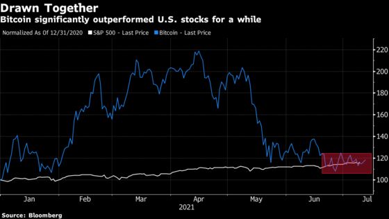
Matching Stocks
The year-to-date percentage gain by Bitcoin was, for a while, several times that of the S&P 500. But as the cryptocurrency came down and equities continued to hit records, that’s changed. They’ve been about the same for a few weeks now.
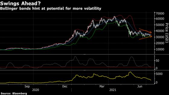
Swings Coming?
The Bollinger bands are coiling around Bitcoin’s price, essentially warning of a coming pickup in volatility. The bandwidth, defined by the percentage difference between the upper and lower bands, is flirting with year-to-date lows, while the 14-day Average True Range is close to its lowest levels of the year.
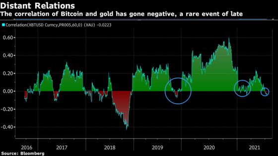
Moving Apart
The rolling 60-day correlation between Bitcoin and spot gold has turned negative, a situation that’s happened only a few times since 2018. That can actually be seen as a good thing, because a lower correlation makes an asset more desirable for diversification purposes in asset allocation. Still, it’s a sign that the “digital gold” moniker some have given to Bitcoin may no longer be so apt.
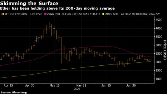
In the Middle
Ether has been floating just above its 200-day moving average in recent sessions, as the line appears to be offering support. That’s the good news. The bad news is that the 50-day average is looking like it might serve as resistance -- and in the $2,300 range, that wouldn’t offer a lot of upside.
©2021 Bloomberg L.P.