These Are the Charts That Scare Wall Street
This year hardly needs ghosts and ghouls of Halloween to make it scary for investors.

(Bloomberg) -- This year hardly needs the ghosts and ghouls of Halloween to make it scary for investors.
They endured the fastest bear-market on record, a similarly spectacular rebound, and are now limping to the end of October with stocks swinging wildly again. Thank the resurgent virus, a slowing economic recovery and the U.S. presidential election for that.
Still on edge as the calendar gets set to flip into the final two months, Wall Street is spooked the most by these charts:
Steve Chiavarone, portfolio manager and equity strategist at Federated Hermes
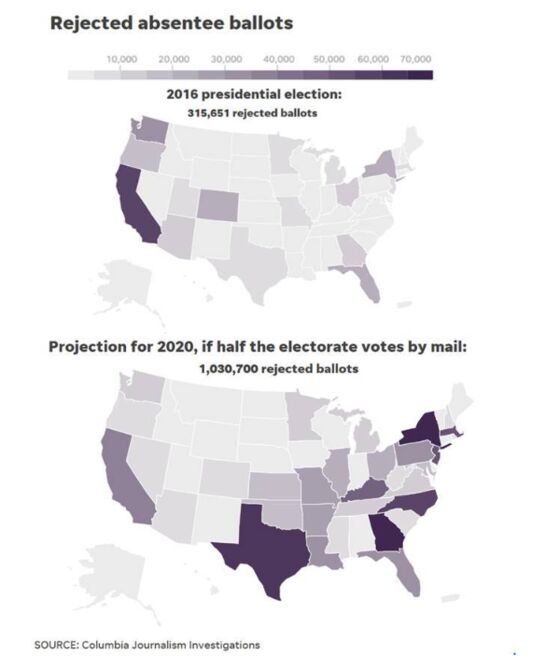
With mail-in balloting potentially hitting upwards of 40-50% of the vote in 2020, given historical patterns, we could see over 1 million ballots rejected in the upcoming election, essentially 3x the number rejected four years ago. This could be the deciding factor in key battleground states. The risk here is that we get a contested election that drags into December and is ultimately decided by courts. In the meantime, the market would have to deal with a greater deal of political and economic uncertainty, while fiscal-stimulus negotiations get pushed to the back burner until the new government is seated in late January.
Jason Thomas, the head of global research at Carlyle Group
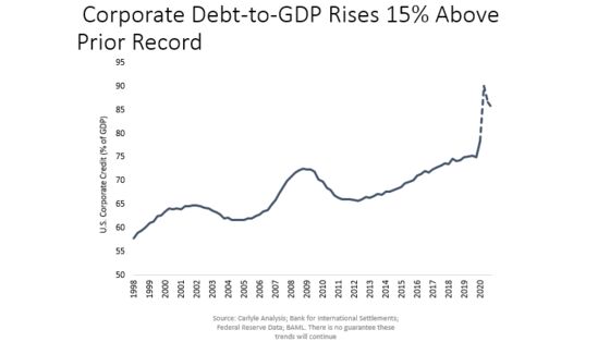
Corporate debt in the U.S. entered 2020 at all-time highs relative to GDP. When accounting for the incremental debt issued in 2020 and netting out restructurings, that ratio seems likely to increase by another 15% this year. Effective debt-service ratios remain at levels comparable to 2001 -- and above those of 2009 -- when default rates on senior loans hit 8%. Rather than a sharp peak and swift subsequent decline, default rates could remain at elevated levels for an extended period, with defaults that would have otherwise occurred in 2020 simply pushed into the future.
Evan Brown, head of multi-asset strategy at UBS Asset Management
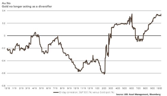
The rolling 63-day correlation between gold and the S&P 500 Index has been positive for the overwhelming majority of 2020. This means gold may no longer be a reliable ballast to portfolios during risk-off periods spurred by concerns about threats to economic activity. We attribute this dynamic to the strong correlation between gold and real rates in concert with the current stance and outlook for monetary policy.
Ben Emons, managing director of macro strategy at Medley Global Advisors
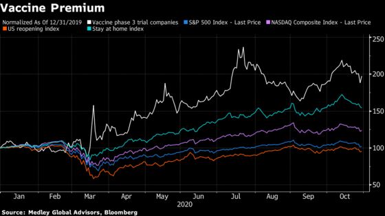
The Covid-19 crisis caused vaccine companies to trade at a historic premium to the S&P, as well as Nasdaq and stay-at-home or reopening sectors. The risk is that a vaccine fails and distribution is hampered by geopolitical tension. The vaccine companies will sell off, and even though their market weight in major indices is lower than technology or major industrials, the performance of vaccine stocks is to be watched in 2021 for their effect on major global-equity indices.
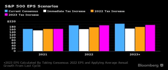
Gina Martin Adams, chief equity strategist for Bloomberg Intelligence
I’d go with policy/tax reform as Wall Street’s biggest fear for 2021, right now, though it is somewhat dependent on the election. The other items I’d consider are the outlook for the dollar, particularly given the federal budget deficit and the concentration of gains in tech, and fears of a repeat of the tech bubble.
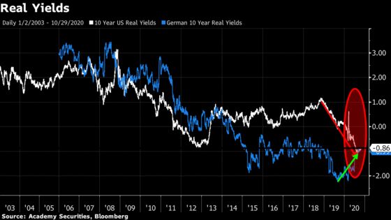
Peter Tchir, head of macro strategy at Academy Securities
U.S. real yields are the most negative they’ve been in the past two decades. Some might argue that dollar weakness is good and would be a competitive advantage, but structural dollar weakness concerns me, especially when we expect to have record amounts of Treasuries to issue. German real yields are now “competitive” with ours. Since the European debt crisis, our nominal yields have looked attractive to Europe, but so did our real yields. Will that real-yield differential turn out to be an important source of buying of Treasuries? This chart “scares” me because I don’t have a good idea of what it really means and what the repercussions might be, while not many people are discussing that.
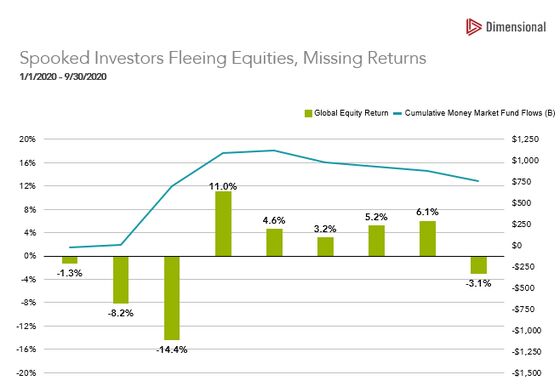
Marlena Lee, head of investment solutions and former co-head of research at Dimensional Fund Advisors
In March, spooked investors fled the stock and bond markets, with money-market inflows for the month totaling $684 billion. This was frightfully bad timing. Over the six-month period from April 1 to September 30, global equities and fixed income returned 29.54% and 3.16%, respectively. Scary to think about the impact that will have on the financial well-being of many savers.
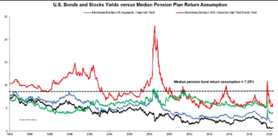
Vincent Deluard, director of global macro strategy at StoneX Group Inc.
U.S. pension funds assume that they will earn 7.25% on their portfolios by mixing assets which yield less than 3% on average. Even if pension funds were to invest solely in the highest-yielding asset (junk bonds), they would still miss their target by about 200 basis points, while taking an amount of risk which would violate their fiduciary duties. Something has got to give: Either asset prices will fall massively to restore normal expected returns (which would trigger an immediate solvency crisis for most pension funds) or pension funds “will die from a thousand cuts” due to an absence of profitable reinvestment opportunities. Either way, most pension plans will fail to deliver their contractual obligations.
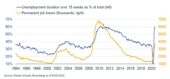
Liz Ann Sonders, Charles Schwab Corp.’s chief investment strategist
Although payroll gains since the April low reflect the re-hiring of temporarily unemployed Americans, the persistent increase in permanent job losses and the surge in the duration of unemployment are both testament to the deleterious longer-term impact of the virus on the economy.
Benn Eifert, chief investment officer of hedge fund QVR Advisors
I used to be an emerging-markets economist in the old, old days. The biggest differences are that in DM, we take rule of law and lack of social/political violence for granted. The last four years we have seen extreme polarization and encouragement of and normalization of political violence in the U.S., and it’s kind of terrifying where that could go if unchecked.

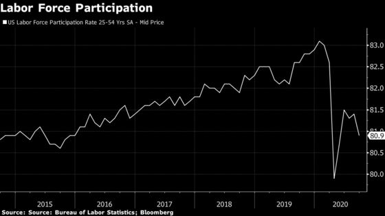
Lauren Goodwin, economist and multi-asset portfolio strategist at New York Life Investments
The prime age labor-force participation has plummeted since the Covid crisis began, erasing the progress seen in the last expansion. After an initial rebound, participation has turned lower once again, suggesting that U.S. policy support measures have not anchored people to their places of employment. The resulting labor-market friction is likely to create a drag on the economic recovery, exacerbating income inequality and creating long-term ramifications for economic growth and financial stability.
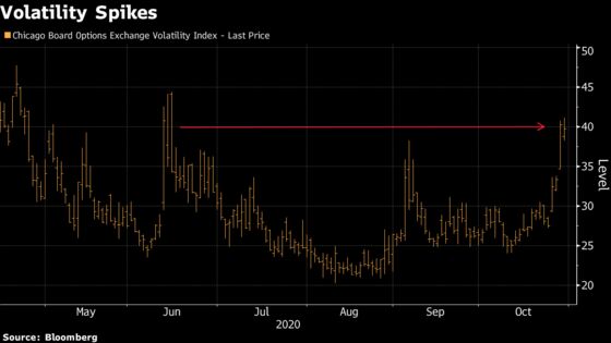
Chris Murphy, Susquehanna International Group’s co-head of derivatives strategy
The VIX closed above $40 for the first time in more than 90 days. This has happened 10 times since 1990, and the S&P 500 is down another 1.1% on average two weeks later. Even scarier? The Russell 2000 is down an average 4.7% two weeks later.
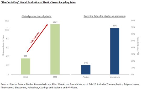
Katie Koch, co-head of fundamental equity at Goldman Sachs Asset Management
Based on current projections, the global production of plastics is set to more than triple by 2050, having already doubled over the past decade. By contrast, 75% of all the aluminum ever produced in the history of mankind is still in use today, with a global recycling rate for aluminum beverage cans standing at 69%. While much still remains to be done to ensure we arrive at a more environmentally sustainable-growth model -- with advancements in biodegradable and more easily recycled plastics forming a key part of that transition -- the reality is for now, “the can is king.”
©2020 Bloomberg L.P.