Not All Yield Curve Inversions Are Fatal

(Bloomberg Opinion) --
Inversion Aversion
The yield curve is almost inverted. Indeed, parts of it are inverted already. And it’s flattened remarkably swiftly. Does any of this matter? A large part of the population is entitled to ask: What does any of this mean?
A yield curve is bond market parlance for the gap between yields on longer- and shorter-dated bonds. As we know less about the future than we do about what will happen tomorrow, longer-dated bonds will tend to have higher yields to compensate for the higher risks involved in buying them. When the gap between short and long yields narrows, the jargon is that the yield curve “flattens.” On the rare occasions that the longer yields fall below short-term yields, this is known as an inverted yield curve.
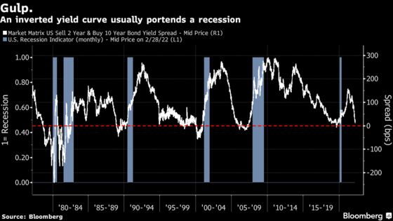
Why does this matter? It commands so much attention for two key reasons. First, yield curve inversions tend to be a great warning that a recession is coming in a matter of months. Second, an inverted curve tends to make life very difficult for banks, who traditionally make their money by borrowing short term (through deposits) at low rates, and lending longer term at higher rates, and pocketing the difference. At times of inversion, life gets much harder for banks. For these two reasons, an inverted yield curve is regarded as an alarm for a central bank — it’s taken as the bond market saying that this can go no further, and makes it hard for the Fed or any other central bank to proceed with a tightening.
Which Yield Curve?
All of this is the subject of hot discussion because the most widely followed yield curve, the spread between 10-year and two-year Treasury yields, is close to zero and therefore not far from inversion. And that’s not good:
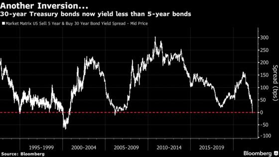
Meanwhile, further along the curve, actual inversion has been achieved. The 30-year Treasury now yields less than the five-year, for the first time since 2006:
The yield curve has long been taken as the best market-based recession predictor we have. So this looks terrifying. Unsurprisingly, there is a chorus of economists arguing that the inversion is different this time, and we don’t need to worry about this one. And despite natural cynicism, the amount of intervention in bond markets since the Global Financial Crisis gives them a decent case.
To start with a minor point, the five-year/30-year yield curve above isn’t a great predictor in any case. It never inverted ahead of 2020, ceased inverting almost two years before the 2008 recession, and provided a false positive in 1994. More to the point, different curves have different messages. The spread between three-month and two-year bonds is as steep as it has ever been, and steepening:
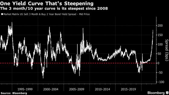
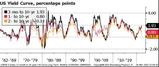
This means a radical difference between the messages of the three-month/10 year and two-year/10-year curves. The former has generally been an even better recession warning, though it delays its signal until closer before the downturn. Historically, there hasn’t been much difference between them. At present, however, they have diverged in spectacular fashion. The following chart, using Bloomberg data and correct as of the close on Friday, was prepared by Win Thin, currency strategist at Brown Brothers Harriman & Co. in New York:
This is a big hint that something genuinely is different this time. Explanations can be found at both ends of the curve.
The Short End
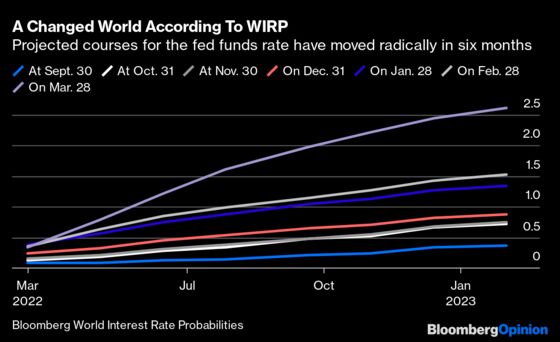
Expectations for rate hikes in the near future have risen in spectacular fashion. The shift in forecasts has happened with breathtaking pace, and this helps to explain the massive excess of the two-year yield over the three-month. Using the Bloomberg WIRP (World Interest Rate Probabilities) function, which derives implicit expectations for the fed funds rate after each successive Federal Reserve meeting using fed funds futures, we see that the market’s expected course for base rates has shot up over the last six months:
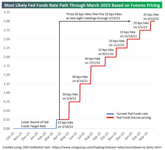
It’s not just our own in-house indicators that show this. To visualize the same information a different way, Bespoke Investment Group offers this chart showing the implicit expectation for the course of the fed funds rate over the next two years, using data from CME Group. It suggests even more tightening than is currently priced by two-year bonds. Nothing as aggressive as this has been seen since Paul Volcker was Fed chair four decades ago:
Is the Fed really going to go through with hiking this much this quickly? There’s certainly a good argument that it must, in order to bring inflation back down to 2%. But there’s also an argument that something will break before the central bank gets there. Commenting on a chart that showed the speed with which the number of expected rate hikes for the rest of the year had risen to eight, Peter Atwater of Financial Insyghts commented:
Maybe it is just me, but I feel like we have seen far too many charts shaped just like the one above lately. From meme stocks to lumber to wheat there is a pattern of wildly accelerating impulsivity that seems to define current investor behavior. That that same unbridled impulsivity now extends to policymakers is hardly a surprise, too. As sentiment following experts, monetary policymakers are behavioral shadows that mirror the crowd’s wildly swinging actions.
He suggests that rate expectations will shoot down as swiftly as the price of meme stocks or lumber futures before them. Even if this is not just a matter of overheated crowd psychology, it’s fair to suggest that the rise in the two-year yield reflects investor confusion in trying to deal with a situation that has no precedent in the working lives of most traders now active. Just as the Fed now admits that it has been behind the curve, so investors have also been slow on the uptake, and may now be over-compensating. That suggests that a curve inversion here should be treated with some caution.
The Long End
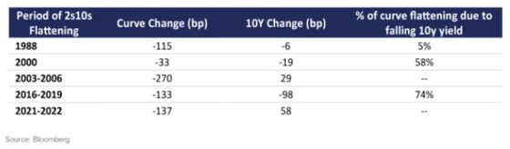
Inversions are generally driven by a decline in long yields as much as a rise in short yields. They have different drivers. As Michael Contopoulos of Richard Bernstein Advisors in New York puts it, two-year yields are driven by policy, while 10-year yields are driven by expectations for growth. Higher yields generally betoken stronger growth ahead. A rising long yield suggests we shouldn’t be too worried about a recession even if the curve is flat or inverted. This is Contopoulos’s breakdown of the two-year and 10-year from peak steepness leading to each of the last four inversions:
None of these prior inversions has followed a rise this great in the 10-year yield. And of course there is a reason why this time is different; massive intervention from the central bank has held the 10-year yield lower than it otherwise would be. To continue with Contopoulos, he suggests that the main yield curve would be nowhere near inverting without the years of QE that preceded it:
Our models show the flatness of the curve could be more a consequence of the Fed’s relentless buying of bonds, and the consequent growth of their balance sheet, rather than because of a looming growth shock. As such, the true fair value of the 2s10s spread could be in the 150bp-200bp range had the Fed never engaged in its multiple rounds of quantitative easing.
The Bernstein model derives 10-year yields from inflation, leading economic indicators, the current fed funds rate and the size of the Fed’s balance sheet relative to gross domestic product — and these deliver a 10-year yield of about 3%. If there had been no QE on these calculations, then the financial world would be a very different place now — and the 10-year yield would be about 3.7%.
Ethan Harris, head of global economics research at Bank of America Corp., offers a couple of thought experiments to show that in these conditions, the yield curve ceases to be a useful recession indicator:
Suppose that a central bank decides that it wants to use balance sheet management rather than policy rates to be the main macro policy tool. So they keep the funds rate at neutral and use QE and QT to move the long end up and down to manage the economy. If the yield curve is truly a reliable indicator of recession risk then the worst thing the Fed could do is use quantitative easing to stimulate the economy as that would invert the curve, "ensuring" a recession. Indeed, it might be better to do quantitative tightening and create as steep a curve as possible.
As another example, suppose markets are convinced that a yield curve inversion is always a reliable signal of recession. Then as the Fed hikes and approaches inversion it will trigger a selloff in risk assets and a sharp drop in bond yields as both markets brace for a recession. However, that will invert the curve even further adding further recession concern and a further drop in stock prices and bond yields.
Just as descending a mountain tends to be more dangerous than climbing it, so we always knew that removing QE stimulus would be more hazardous than applying it in the first place. One of the manifestations of this is the bizarre behavior of the yield curve, which is sending confusing and contradictory signals as a result.
This line of thinking suggests (good news) that we needn’t be too worried about the flatness of the curve but that (bad news) the likely start of QT (quantitative tightening) in May is something to fear. The Fed has only just stopped buying longer-dated bonds, which was done in an unabashed attempt to reduce their yields. QT could well steepen the curve, but do it by raising long rates sharply, to levels that might jeopardize credit markets in the U.S. and elsewhere. With the Bank of Japan recommitting to its intervention to keep 10-year yields low on Monday, it also promises to strengthen the dollar yet further, which will have further implications.
It’s not necessarily good news if 10-year yields are about to go up sharply. But at least it should protect us from the dreaded yield curve.
The Arrow of Causation
Furthermore, when interpreting the yield curve evidence, one should keep in mind the adage “correlation is not causation.” Specifically, the predictive relationship of the term spread does not tell us much about the fundamental causes of recessions or even the direction of causation. On the one hand, yield curve inversions could cause future recessions because short-term rates are elevated and tight monetary policy is slowing down the economy. On the other hand, investors’ expectations of a future economic downturn could cause strong demand for safe, long-term Treasury bonds, pushing down long-term rates and thus causing an inversion of the yield curve. Historically, the causation may well have gone both ways. Great caution is therefore warranted in interpreting the predictive evidence.”
There are very many reasons for concern about the direction of the U.S. and world economies at present. The startling compression of the yield curve is a symptom of those problems. And the yield curve should never be ignored. But its behavior at present is more an indicator that the distortions caused by the interventions of the last decade or so can no longer be sustained, rather than a foolproof indicator that we are about to fall into a recession.
Survival Tips
I’m going to try a fashion tip. My knowledge of, and interest in, fashion is somewhere between minimal and non-existent. But friend and former colleague Rob Armstrong now serves ably as the men’s fashion correspondent of the Financial Times (I'm told he also covers markets sometimes) and recently penned this fascinating piece on the death of the necktie. I’m with him 100% on this.
Office dress codes are more relaxed now. When I started as a financial journalist, it was unthinkable to go to a press conference, or enter a head office, without a jacket and tie. The current dress code is more relaxed and comfortable, but it’s also utterly drab. Men almost have to go out of their way to look as boring as possible. At least a tie offered the chance for a splash of individuality.
Now, I gather from Rob’s piece, ties are being used as handy components for patchwork. Stitch a bunch of old ties together and they can be made into a beautiful dress to be worn by someone female. It’s all rather sad, particularly for those of us who have a large and virtually unusable tie collection.
My tip is not to give up on the tie completely, because a good tie is a work of art, and it offers the chance of self-expression. Like vinyl, ties will be back. And for a recommendation, my one extravagant spending on clothing over the years has been on silk ties based on Mexican designs from Pineda Covalin. They’re expensive, and they’re fantastic, and it became a ritual to buy one every time I passed through the Mexico City airport. Have a look. Any other suggestions for great neckties gratefully accepted.
More From Other Writers at Bloomberg Opinion:
- The Yen's Plunge Is a Dilemma of Japan's Own Making: Daniel Moss
- Shanghai's Much- Too-Gentle Covid-Zero Policy: Shuli Ren
- First Help Ukraine to Survive, Then Beat Putin: Clive Crook
This column does not necessarily reflect the opinion of the editorial board or Bloomberg LP and its owners.
John Authers is a senior editor for markets. Before Bloomberg, he spent 29 years with the Financial Times, where he was head of the Lex Column and chief markets commentator. He is the author of “The Fearful Rise of Markets” and other books.
©2022 Bloomberg L.P.