Mapping Where It’s Getting Hotter and Where It’s Not
(Bloomberg Opinion) -- According to the sixth assessment report of the United Nations’ Intergovernmental Panel on Climate Change, the first part of which was released this week to much fanfare, global average temperatures, currently about 1.1 degrees Celsius over the “pre-industrial” (1850 to 1900) baseline, will pass the threshold of 1.5 degrees over the baseline sometime in the early 2030s.
It’s a safe bet that this will in fact happen. The climate models developed in the 1970s and 1980s have done a fairly good job of forecasting the trajectory of global average temperatures since then. If you correct for early errors in estimating how much carbon dioxide and other greenhouse gases would be emitted, they’ve done a great job. The latest IPCC assessment reflects continued improvement in the models, and narrows the range of likely outcomes by the end of this century to warming over the pre-industrial baseline of between 1.4 degrees Celsius (assuming a decline in CO2 emissions) and 4.4 degrees (assuming a tripling of CO2 emissions from current levels). Again, you can probably bet on the accuracy of that.
Still, it’s a big range, and the concept of global temperature change can be a little hard to get one’s head around. So I went to the National Oceanographic and Atmospheric Administration’s National Centers for Environmental Information website in an attempt to make things a bit more concrete.
NOAA reports temperatures in Fahrenheit and uses a different baseline, the 1901-2000 average. A 1.5-degree change in Celsius is 2.7 degrees in Fahrenheit, and 1.1-degree change is 2 degrees. According to the Berkeley Earth database, average U.S. temperatures were about one degree Fahrenheit warmer from 1901 to 2000 than from 1850 to 1900.
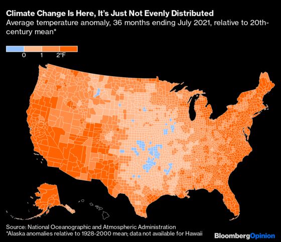
Of the 3,136 counties (and Louisiana parishes, Alaska boroughs, independent cities in several states, and the District of Columbia) for which NOAA has data, 2,197 experienced average temperatures over the past three years that were a degree Fahrenheit or more higher than the 1901-2000 baseline, and 1,386 were 1.7 degrees hotter or more. Add a degree to roughly represent the difference between the 1901-2000 and 1850-1900 baselines (the actual county-by-county differences would of course vary widely), and 70% of U.S. counties have experienced temperatures over the past three years that put them at or above the IPCC-estimated 1.1-degree Celsius global increase relative to 1850-1900, while 44% were 1.5 degrees hotter or more.
As is apparent from the above map, this temperature rise has been concentrated in the East and West, with the middle of country seeing far less increase. In Oklahoma, 29 of 77 counties experienced cooler temperatures over the last three years than the 1901-2000 average, which makes me a tad more understanding of the persistent climate denialism of the state’s senior U.S. Senator, Jim Inhofe. Overall the correlation between the past three years’ temperature anomaly and the percentage of a county’s population that believes the planet is warming, according to the estimates of the Yale Program on Climate Communication, is a weakly positive 0.36 (with one meaning perfect correlation and zero none at all). The two states with the lowest percentage of residents who believe global warming is happening, West Virginia and Wyoming, also happen to be the nation’s top two producers of coal, which suggests a major role for economic factors.
Another factor is the passage of time. A decade ago, the map wasn’t nearly as orange.
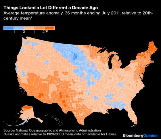
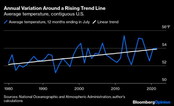
Some of this is just natural climate variation. The three years ending in July 2011 were the coolest in the U.S. since 1995; a chart from 2008 or 2012 would have a lot more orange on it. Things would also look different if I picked two-year or five-year averages instead of three. And so on. But there’s also been a clear warming trend in the U.S. since 1980, and for the past two years temperatures have been almost right on trend.
Perhaps not entirely coincidentally, U.S. adults’ agreement with the propositions that global warming is happening and humans are causing it, which fell early in the last decade after several years of below-trend warming, has been mostly rising ever since.
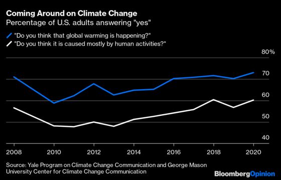
It’s often lamented that we’ve understood the risks posed by greenhouse gases for at least 40 years, but failed to act on that knowledge in the U.S. because of oil-company misinformation, Republican Party nihilism and all-around fecklessness. That’s not entirely wrong! But the evidence for global warming has also become much stronger than it was in the 1970s and 1980s. Most Americans are experiencing it now in their daily lives.
Of course, we don’t exactly experience the average temperature changes that I’ve shown here. What gets noticed are extremes. The IPCC report contains a handy summing-up of how much global warming is increasing the odds of various extreme weather events, according to current scientific consensus.
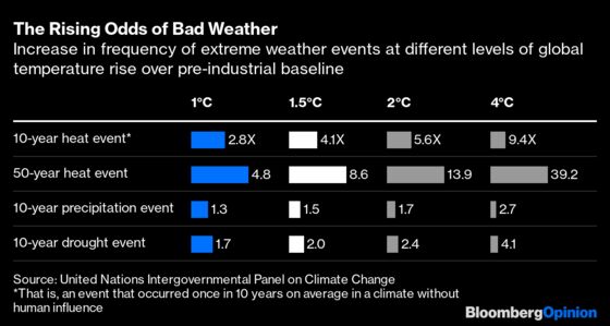
Extreme heat events are becoming far more likely, which makes sense given that the earth’s atmosphere is warming. For heavy precipitation and droughts, the connection with climate change appears to be real but much weaker. If this assessment is correct, the media tendency to attribute virtually every flood to climate change is misleading, and for most places the effects of increased heavy-precipitation events and/or droughts may be manageable in the coming decades. The heat waves may not be, though, and there are all sorts of other bad things that can happen that aren’t captured in the above chart.
This column does not necessarily reflect the opinion of the editorial board or Bloomberg LP and its owners.
Justin Fox is a Bloomberg Opinion columnist covering business. He was the editorial director of Harvard Business Review and wrote for Time, Fortune and American Banker. He is the author of “The Myth of the Rational Market.”
©2021 Bloomberg L.P.