(Bloomberg Opinion) -- Twitter doesn’t have an edit button. Despite a chorus of protest over many years, the company has declined to bow to user demand — indeed, as Covid-19 raged, Twitter trolled its 330 million users with this taunt:
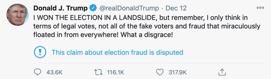
This absence of edit mirrors a range of controversial Twitter innovations — including switching the “validation” button from a star to a heart; re-ordering the timeline from chronological to “relevant,” despite promising not to; and (merely) adding warning labels to President Donald Trump’s inaccurate and inflammatory statements:
Although redesigns and feature tweaks are predictably unpopular (and early outrage usually fades), motives seem to matter. Indeed, their importance may bode ill for Facebook’s latest iteration of Instagram, which replaced the “Compose” button with its TikTok competitor, “Reels,” and the “Activity” button with its e-commerce venture, “Shop.”
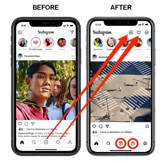
Much like the supermarkets that re-order shelves to disrupt our well-worn routines, by monkeying with the position of Instagram’s most popular buttons, Facebook is abusing years of muscle memory to wrong-finger a billion users into clicking more lucrative features. The reaction to these self-serving changes was swift and harsh:
The look, layout and actions of app interactions are examples of what designers call the User Interface (U.I.), which is one element of the broader User Experience (U.X.). So central is U.I. to the success of modern products and services, the field has spawned a library of books and articles, as well as a burgeoning academic specialty.
However, as customers become increasingly sophisticated, demanding and vocal, the designs that succeed in the future are likely to be those that reimagine U.I. as User Indulgence.
The power of user indulgence lies in its recognition of our whims, weaknesses and inherent contradictions. Indulgent design allows products and services to dovetail with life as it is actually lived which, in turn, enables brands to form genuine and lasting customer connections.
* * *
Consider the snooze button.
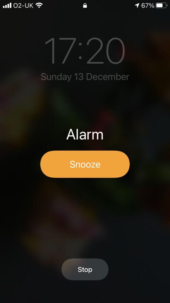
People have long debated whether alarm clocks have a standard duration of snooze and, if so, why it seems to be nine minutes. But the button itself, popularized in the 1950s, is more intriguing for what it represents. Even the cheapest alarms deliver an accuracy that horology’s pioneers could never have envisioned, yet all of them feature a button that should be labeled: “Thanks for waking me to the nanosecond I requested … but now I want to doze.” And this feature is seldom shy. Compare the size, color and position of the iPhone’s snooze button with the button that stops the alarm:
The snooze button is a perfect illustration of user indulgence, where sophisticated functionality is modified — or entirely contradicted — to accommodate human frailty and whim.
Indulgence is everywhere.
Steam irons, water heaters, electric blankets and Christmas lights incorporate “auto switch-off” timers to indulge our absentmindedness and reduce the risk of fire. Kettles have “keep warm” functions to save us from endlessly re-boiling the same water. Certain fountain pen cartridges have an ink reservoir that when smartly flicked discharges enough ammunition for a few more pages. And some pain-relief systems incorporate a “bolus” button to override the regulated flow of drugs when patients need, say, a hit of morphine.
Most toasters have eject buttons that countermand their timers; Heston Blumenthal’s toasters offer indulgent “Quick Look” buttons to inspect your toast, and “A Bit More” buttons to brown your bread a smidge longer. Similarly the Whirlpool GMC275 microwave has buttons to “cook a bit more” and “add a minute.”

The Post-It Note sits alongside Velcro as a triumph of re-adherable indulgence, and intermittent windshield wipers — inspired by the irregular blinking of a human eye — speak for themselves. Wage envelopes feature plastic windows and cut-away flaps so that the cash inside can be counted before opening, and a range of banks and fintech apps indulge our ambivalence toward change (and thrift) by rounding-up purchases to the nearest dollar and sweeping the cents into savings or investment accounts.

Google’s “Did you mean?” spell-check reflects an indulgence of hunt-and-peck typing as well as thick-thumbed spelling. And music streaming services such as iTunes and Spotify deliberately de-randomize their shuffle algorithms because the patterns that form in truly random selections don’t feel random to the listener.
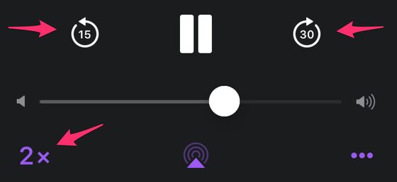
The impact of such user indulgence on advertisers is one thing; its effect on content creators will soon be tested further by Netflix, which has recently allowed those watching on mobile devices to speed up and slow down playback — an innovation that has not been universally applauded:
* * *
Because indulgence speaks to profoundly human instincts, its absence can feel unjust. This feeling of perceived injustice explains why many otherwise obdurate systems (credit card companies, website domain renewals, patent applications) build in “grace periods,” and why boxing, since 1743, has given floored pugilists a “count” to recover on the canvas. Similarly, computer games feature “respawn protection,” allowing freshly-reanimated players to get their bearings before once again being slain.
Of course, indulgence also enables authorities to elide questions concerning the accuracy and calibration of their measurements. In other words, pragmatism — rather than goodwill — may guide the marginally flexible enforcement of parking meters, breathalyzers, speed cameras and other punitive equipment.
In some cases user indulgence is driven by the threat of harm. The “baker’s dozen” (13 instead of 12) supposedly derives not from generosity but from the severe punishment meted out for “short selling.” Similarly, some British pint glasses are deliberately oversized to allow for a frothy “head” atop the full legal measure. Despite the ban on smoking on all commercial flights, even the latest planes are required to have bathroom ashtrays so miscreants can safely stub out their cigarettes when the smoke alarms sound. And many of the fences erected around construction sites, to keep the public out and the debris in, incorporate viewing holes to indulge our insatiable curiosity. (The best have holes at lower heights for kids.)
In certain situations user indulgence is precisely that — most brazenly the hierarchy of “comps” (free drinks, room upgrades, cash back, private jets) dealt out by casinos to pacify regulars and reel in high-rollers. Over recent decades the hospitality industry has become increasingly fixated on “wow moments” — unexpected indulgences that provoke surprise, delight and social-media love. Back in the day it was chocolates on the pillow, towel-folded swans, late check-outs and hand-written notes of welcome; nowadays it is bespoke amenity kits, initial-embroidered pillowcases and personalized extras inspired by online research of customer peccadillos.
Indulgence can also celebrate a higher purpose. Certain Japanese shrines incorporate intentional errors (such as the “evil inverting pillar”), lest perfection invite bad luck; orthodox Jewish synagogues and homes leave an element of their structure unfinished to honor the destruction of the Second Temple; and, so the oft-told tale goes, Persian rug weavers add deliberate flaws to their work because only the divine is faultless.
Splendidly, this school clock in north London manages to be indulgent, educational, encouraging and stern:

Antagonism
The power of indulgence is usefully illustrated by its opposite: antagonism.
So commonplace is corporate antagonism that the tropes of obstructive and obnoxious customer interaction have become a staple of stand-up comedy. Douglas Adams nailed the frustration in “The Hitchhiker’s Guide to the Galaxy”:
“But the plans were on display …”
“On display? I eventually had to go down to the cellar to find them.”
“That’s the display department.”
“With a flashlight.”
“Ah, well the lights had probably gone.”
“So had the stairs.”
“But look, you found the notice didn’t you?”
“Yes,” said Arthur, “yes I did. It was on display in the bottom of a locked filing cabinet stuck in a disused lavatory with a sign on the door saying ‘Beware of the Leopard’.”
Certain market sectors seem to thrive on antagonism. Airlines, utility companies, gyms, banks and insurers, for example, deploy a bewildering arsenal of contractual trip-wires and price obfuscations — exclusions, penalties, premiums, overages, add-ons, deductibles, co-pays, minimums, endorsements, time limitations, blackout periods, booking fees, cancellation fees, installment charges, offers available only to new customers, offers available only to members, offers that auto-renew at a higher rate — that are designed to frustrate, fatigue and ultimately fleece the consumer.
Even offers that seem indulgent can be stealthily hostile. For instance, supermarket multi-buys — “three for two,” “buy one get one free,” “buy one, get one half-price” — not only confuse customers and encourage excess consumption, obesity and waste, they also penalize the poor, the elderly, the single and those who rely on public transport to schlep home their shopping.
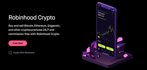
It’s hard not to see such antagonisms as cynically calculated when even the most intricate systems can be simplified when the will exists. The world of investing — so long portrayed as complex and specialist — has recently been upended by fintech apps such as Webull and Robinhood that streamline and gamify trading, some would say to a fault. As Christine Ji noted:
“In the eyes of many, the lighthearted nature of the Robinhood app fails to truly convey how serious investing is. Novice investors, perhaps bored at home during this time of quarantine, can be deceived by what seems like a grown-up version of a mobile game. For starters, the flashing green and red lights, as well as the confetti, often lead users to act on their emotions instead of keeping a calm and level head. … The app’s accessibility, combined with the emotional cues, can quickly lead inexperienced investors in too deep as they pursue a dopamine rush from their screens.”
Every so often brands seek to defy the antagonisms of their sector by appealing to the indulgent concept of “humanity.” JetBlue launched with a mission to “bring humanity back to air travel”; Liberty Mutual Insurance ran a “Humans” campaign (complete with the Human League hit “Human”) to promote “our empathy toward policyholders in times when they need us”; and TD Bank sells itself as “unexpectedly human” — as if the very idea of humanity in banking was novel:
“Don’t be alarmed if we smile. We’re the bank that defies expectations. You can feel it the moment you walk in, call us or open our app. We run on human hours, not the typical 9 to 5, so you can pop in early, late and weekends. And it doesn’t stop there. We’ve got your back around the clock with 24/7 fraud alerts—and in-store debit card replacements faster than you can say, “It’s a long story.” The most unexpected part? We’re happy to do it all.”
The fact that airlines, insurers, banks and others find it not just valuable but differentiating to promote their basic humanity illustrates the power of indulgence in antagonistic sectors.
Friction
Many moments of user indulgence derive from the identification and resolution of friction — allowing air passengers with children to board first, say, or including a pre-stamped envelope with a bill. Indeed successful startups are often premised on eliminating friction, especially when that friction has long been suffered as the cost of doing business.
Setting aside the issue of price, ride-sharing apps such as Uber and Lyft instantly eliminated at least eight points of friction which, for generations, had been considered an inevitable part of taxi-hailing:
-
Standing on the street (in all weathers) hoping an empty taxi drives past
-
Requiring cash, or locating an en route ATM
-
Noting the driver’s name in case of a complaint
-
Not knowing the upfront cost of a trip
-
Calculating a tip
-
Checking change
-
Keeping receipts
-
The improbability of reacquiring lost property

While these frictional moments have always been irksome, they did not feel especially onerous because (absent a car service or chauffeur) there was simply no alternative. Only once Uber et al. had smoothed away the friction did the taxi-hailing experience seem archaic and antagonistic — which is why many licensed taxi drivers have been forced to join Uber-esque platforms such as Waave, Curb, Arro and Free Now.
* * *
Admittedly, user indulgence is simpler in the luxury, local and bespoke sectors, where there is money, time and manpower to spare. But even mass-appeal brands can incorporate the principles of indulgence into their designs. More often than not this involves abandoning brand ego, and thinking like the user — which is evidently easier said than done.
In early October, Google relaunched its G Suite product as Google Workspace to unify Gmail, Calendar, Drive, Docs, Sheets, Slides, Meet (and others) into “a new, deeply integrated user experience.” Inevitably this relaunch required “a new brand identity that reflects our ambitious product vision and the way our products work together,” which meant redrawing the icons that almost two billion users click on multiple times a day.
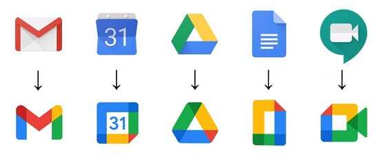
As with so many corporate redesigns, the theory behind this work is impeccable: a unified look and feel that draws upon the core components of the master brand. The reality, however, was user outrage and design derision, for what seems stylish at scale on a crisp white monitor becomes chaotic and confusing when shrunk to a 16-pixel icon.
* * *
This is not to say that user indulgence should capitulate to every consumer caprice.
For those prone to abusing their oversized snooze buttons, there’s Clocky, the alarm-clock on wheels that, as it erupts in sound, leaps from the nightstand and zooms off at speed, forcing “snooze abusers” to unduvet themselves and hunt out its hiding place.
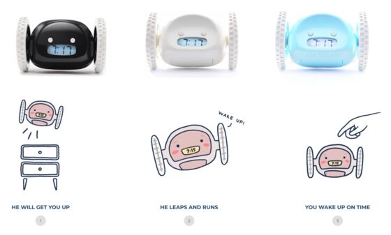
Sometimes, even the most indulged users need a wake-up call.
This column does not necessarily reflect the opinion of the editorial board or Bloomberg LP and its owners.
Ben Schott is a Bloomberg Opinion visual columnist. He created the Schott’s Original Miscellany and Schott’s Almanac series, and writes for newspapers and magazines around the world.
©2021 Bloomberg L.P.