(Bloomberg Opinion) -- Facebook Inc., you may have heard, has changed its name to Meta.
Setting aside, briefly, the vital debate on Facebook Inc.’s myriad evils, and focusing specifically on the name and brand, there are some elements of note.
Given there is no “good” name for a “bad” company — and that nothing Mark Zuckerberg might do could ever win the internet — avoiding catastrophe was the bar. So far, for Zuck, so good.
First, the name.
Meta is fine. Not fabulous, not horrific, but fine. However, “fine” may be the sweet spot for such an endeavor. Too elaborate, creative or funny a name would have merely added fuel to the raging fire, rather than doused it with dullness. When Penguin merged with Random House, the world crossed its fingers for “Penguin House” or even “Random Penguin” — but had to acknowledge the good-sense sobriety of “Penguin Random House.”
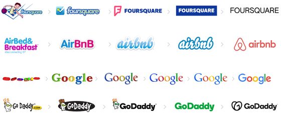
People have rightly noted the tendency of in-trouble or out-of-touch brands to rename. At one end of the spectrum are brands that have the taint of horror (Blackwater, Philip Morris). At the other, are brands that merely wish to reposition their public perception (Weight Watchers, Dunkin’ Donuts), or react to changing times (Aunt Jemima, Uncle Ben’s). There’s nothing intrinsically wrong with rebranding. PayPal used to be Confinity; eBay was Auction Web; and Instagram was Burbn. And let’s not forget, calling an $839-billion advertising platform after a printed college “face book” is as anachronistic as Britain’s Carphone Warehouse — which for many years neither sold carphones, nor operated from a warehouse.
Of course, Facebook is not like other brands — not least because it contains multitudes. On the one hand, Instagram is a machine calibrated to create and monetize FOMO, and to hell with the toxic consequences. On the other, WhatsApp is a telecommunications lifeline for hundreds of millions, as the world discovered when its servers crashed for just six hours.
Although “meta” translates as “died” in Hebrew, and may have sexual overtones in Brazil, the name does not appear to be existentially offensive in any of the world’s major languages. And presumably the company has deep enough pockets to settle any trademark disputes.
On the plus side, Meta probably nudges the company toward its stated “metaverse” destination — since every time the name is spoken (regardless of the accompanying sneer) it helps. No matter how convoluted or contrived they are, brand words matter. Starbucks has not trademarked a vast vocabulary of coffee gibberish for the fun of it. Every time a baffled customer enunciates the word venti, grande, frappuccino, puppuccino, affogato, strato, mixato, arriviamo, strato or fizzio — an Italian may shudder, but Starbucks wins.
Soon after the new name was announced, Jack Dorsey, the CEO of Twitter, responded:
Although Jack’s aim was clearly snark, he may have struck upon one of Meta’s strengths. Meta is “self-referential” — both in literal meaning and corporate context. And as every politician knows, at least half the battle is defining the subject of the debate.
* * *
The brand itself is also fine.
Although the textmark uses the corporate typeface introduced in 2019, its lowercase setting seems far less stylish and current.
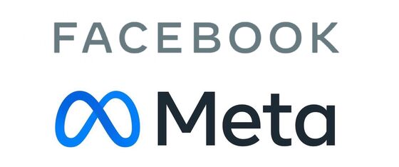
Interestingly, despite the modernity of the metaverse, there’s something very clunky about Meta’s look and feel. Colorwise, the logo sticks with the “startup blue” long associated with internet OGs like Facebook, LinkedIn and Twitter. And the logo’s gradient already appears dated, especially when so many brands are shedding dimensionality and shading.
To be fair, the version of the logo most widely distributed does not tell the whole story. Like all major modern brands, Meta is more than a static mark:
“The Meta symbol was designed to dynamically live in the metaverse — where you can move through it and around it. It can take on infinite textures, colors and movement, capturing the creativity and imagination of a 3D world.”

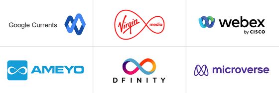
But, despite the bells and whistles of infinite digital iterations, there remains something essentially generic about Meta’s look and feel. At this point, using the infinity logo — 356 years after the mathematician John Wallis invented it — is not just a cliche, it’s a cliche in a crowded field:
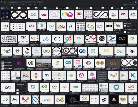
So if Meta looks like a supercharged version of a brand you’d get from one of the many websites offering cheap or free design, that may be part of the plan. Just Google “infinity logo stock” and see what you get:
* * *
Almost three decades after Prince changed his name to an unpronounceable “love symbol,” the Purple One is still referred to by many as “the artist formerly known as Prince.” But while this nickname is knowing, affectionate even, Facebook’s fate is unlikely to follow suit. Zuckerberg is clearly hoping that Meta will allow him to shrug off, or hive off, the most problematic parts of his empire. It’s more likely that Meta will remain “the brand formerly known as Facebook” not just for market clarity, but to nullify Zuck’s attempt at brandwashing.
This column does not necessarily reflect the opinion of the editorial board or Bloomberg LP and its owners.
Ben Schott is Bloomberg Opinion's advertising and brands columnist. He created the Schott’s Original Miscellany and Schott’s Almanac series, and writes for newspapers and magazines around the world.
©2021 Bloomberg L.P.