(Bloomberg Opinion) -- Clubhouse — the audio app that blitzed to a value of $4 billion, and obsessed media social-media during Covid-19’s dull lockdowns — recently trailed a new branding device: a cupped-hand “C” gesture, designed to “evoke feelings people experience in a Clubhouse room.”
“Users are metaphorically peeking inside the peephole, cupping their ears to hear the laughter inside, amplifying their voices, or whispering to a friend.”

Representing a polyglottal audio brand with a gesticular monogram that wordlessly communicates (and humanizes) multiple brand characteristics is a smart idea. It’s certainly smarter than Clubhouse’s handwave emoji logo. Who knows, it may help fend off a tsunami of competition from Twitter, Spotify, Discord, Facebook, Telegram, Airtime, Lizhi, Stereo, Stationhead and Spoon — to name but a few.
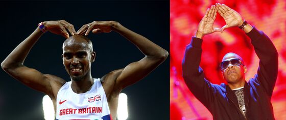
Although tech companies have long sought to own specific gestures (“slide to unlock,” “swipe right” and even shaking your phone), symbolic gestural branding has primarily been the province of individuals. One thinks of Bruce Lee’s flying kick; Michael Jordan’s “jumpman”; Shaquille O’Neal’s “dunkman”; Alex Rodriguez’s “bat swing”; Usain Bolt’s “lightning strike”; Tim Tebow’s “Tebow”; Mo Farah’s “Mobot”; Jesse Lingard’s “JLingz”; Gareth Bale’s “11 of Hearts”; Paul Pogba’s “dab”; and Jay-Z’s “diamond” — many of which have been legally protected.
Yet Clubhouse’s corporate foray into symbol branding — considered alongside the trends of blending and debranding — seems to be part of a wider evolution toward a new style of universal wordless communication. Call it “brandsperanto.”
Esperanto is an “international language” created in 1887 by a Polish ophthalmologist, Ludovic Lazarus Zamenhof. Significantly, Esperanto was devised not as a universal language, to replace all others, but as a second language, to augment one’s mother tongue.
Zamenhof believed that if we all spent a single hour learning Esperanto’s grammar, and memorized just 900 Esperanto words (“the mere light amusement of a few days”), the world must inevitably become more civilized:
“Not being understood we keep aloof, and the first notion that occurs to our minds is, not to find out whether the others are of our own political opinions, or whence their ancestors came from thousands of years ago, but to dislike the strange sound of their language.”
Civilization was one thing, but Zamenhof also recognized Esperanto’s potential for trade:
“Any one, who has lived for a length of time in a commercial city, whose inhabitants were of different unfriendly nations, will easily understand what a boon would be conferred on mankind by the adoption of an international idiom, which, without interfering with domestic affairs or the private-life of nations, would play the part of an official and commercial dialect, at any rate in countries inhabited by people of different nationalities.”
Even if you accept the most bullish estimates of Esperanto participation, 2 million speakers in a population of 7.9 billion, after 134 years, is a tad disappointing. That said, there are signs that a new symbolic second language may be evolving and, as ever, commerce is at the vanguard.
Less Ink, More Meaning
In his 1983 classic, “The Visual Display of Quantitative Information,” the Mondrian of infographics Edward Tufte coined the term “chartjunk” to describe the extraneous ornamentation which, though pleasing to designers, baffles the reader and disserves the data:
“Graphical decoration … comes cheaper than the hard work required to produce intriguing numbers and secure evidence.”
Tufte’s solution was “data-ink maximization,” where visual gimmicks, grid lines, hatching and shading are ruthlessly eliminated until one discovers “the non-erasable core of the graphic.”
“A few graphics use every drop of their ink to convey measured quantities. Nothing can be erased without losing information …”
In many ways, contemporary (re)branding is following Tufte’s lead: stripping back superfluity until viewers can glean in a glance the “non-erasable core” of the commercial proposition.
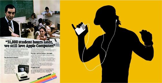
Significantly, this glance is less about recognition (sight), than perception (feeling). For example, Microsoft’s windowpane logo might be as widely recognized as Apple’s partly chomped fruit. But given a choice between two mystery boxes featuring one of these logos, which would you pick, and why?
Although brute-force spending can impose brand recognition, true brand perception comes only through hard-won clarity, consistency and conviction — as epitomized by another widely recognized symbol brand, the 158-year-old International Red Cross and Red Crescent.

Unique Symbolic Proposition
In 2016, Mastercard unveiled the latest chapter in its five-decade story of red-and-yellow spheres:
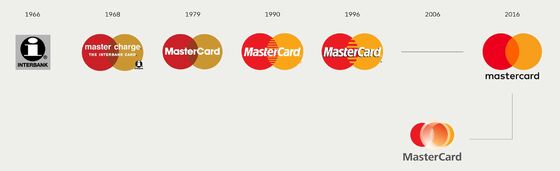
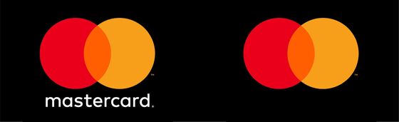
By deploying approachable lowercase lettering and elegant transparency blending, this new iteration was undeniably elegant and au courant — and a world away from the car-crash rebrand of 2006, which failed even to master the elementary art of centering. However, the real revolution came in 2019, when Mastercard announced that, in selected contexts, the company would drop the use of its name altogether:
Michael Bierut, one of the Pentagram partners responsible for the redesign, explained the move:
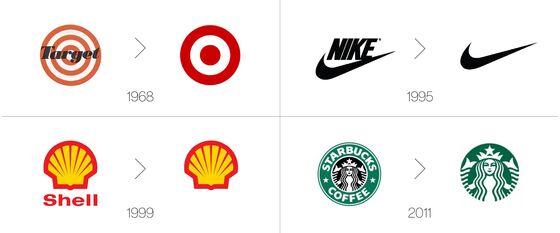
“Increasingly, we communicate not through words but through icons and symbols. … Now, by allowing this symbol to shine on its own, Mastercard enters an elite cadre of brands that are represented not by name, but by symbol: an apple, a target, a swoosh.”
This “elite cadre” of no-name commercial brands dates back not merely decades …
… but centuries — as can be seen in the Carnavalet Museum’s spellbinding collection of early Parisian shop signs, which were erected to inform illiterate consumers who, even if they couldn’t read the words “La Fourchette,” recognized a massive fork when they saw one:

Interestingly, similar trends of commercial simplicity can be tracked in advertising which has, over the years, seen a retreat from the highly crafted long copy beloved of David Ogilvy and Neil French, to the simplest of no-name silhouettes.
Indeed it’s fair to say that Bierut’s “elite cadre” is becoming overcrowded. It says something when even Pret A Manger feels confident enough to hang a no-name sign:
* * *
Brandsperanto
What, then, is driving this trend?
First, the usual suspects: The ebb and flow of branding fashion; the pixel constraints of digital design; and the urgent need for instant hits to pierce through our fog of inattention.
More interesting, however, is the sense that these wordless silhouette brands are inveigling themselves into a wider trend of universal symbolic communication. As the feedback loop between digitalization and globalization becomes ever more amplified, so communication is evolving to become not just platform agnostic, but polyglottic — even in non-critical contexts.
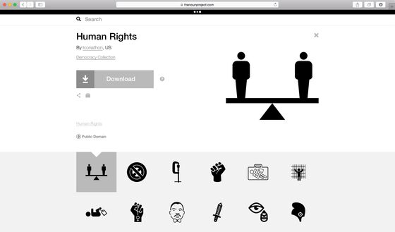
This explains the ubiquity of icons and symbols across brand websites and corporate literature, and the popularity of ventures like The Noun Project — a remarkable collection of icons (representing every conceivable activity) designed to establish “a global visual language that unites us.”
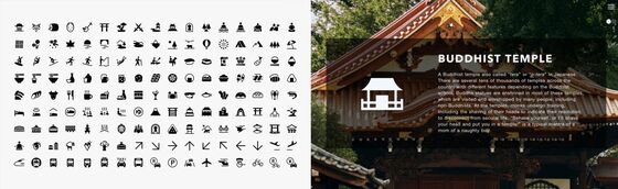
Two graphical innovations in the run-up to the 2020 Olympics help illustrate the trend. First, the announcement that Tokyo was to be the first games to illustrate the 22 Paralympic and 33 Olympic sports with animated icons:
And second, the Nippon Design Center’s launch of “Experience Japan Pictograms,” a portfolio of 280 free-to-use icons — from sumo to Kabuki — designed “to invite visitors to explore and enjoy Japan a little deeper than before.”
Perhaps, in part, because of the sophistication and elegance of its three character sets (kanji, hiragana and katakana), Japan has a distinguished history of potent graphical simplicity. Indeed, the relentless pressure we daily feel to slog 10,000 steps seems to derive not from any medical evidence, but from a 1960’s marketing campaign for the Japanese pedometer Manpo-Kei (man=ten thousand; po=step; kei=meter), so named because the character for “10,000” vaguely resembles a figure walking.

Emojification
Nowadays emojis are regulated by the Unicode Consortium, a non-profit corporation which undertakes the Herculean task of ensuring that written communication synchronizes across all programs, platforms and operating systems. The latest Unicode Standard (v.14) runs to 1,020 pages and defines 144,697 characters in 159 scripts, including the new additions of Toto, Cypro-Minoan, Old Uyghur, Vithkuqi and Tangsa.
When it comes to deciding which objects, actions or emotions are worthy of emojification, the Consortium operates a little like the Academie Francaise — although without the ceremonial swords and £40,000 bespoke robes. And once a new emoji is approved for inclusion, each platform is responsible for designing how it will look in their style.
* * *
Although emojis may not (yet/ever?) be sophisticated enough to form a universal language capable of literature, philosophy or nuanced diplomacy, it’s not clear they signal a descent into the linguistic dystopia of George Orwell’s “Newspeak.”
First, because the emoji lexicon is relentlessly growing (from 1,145 unique icons in 2010 to 3,633 today), whereas “Newspeak was designed not to extend but to diminish the range of thought, and this purpose was indirectly assisted by cutting the choice of words down to a minimum.”
And second, because the arc of the emoji universe, unlike that of Newspeak, seems to be bending toward justice — with a timeline that embraces diversity of race, creed, gender and ability.
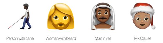
Individual platforms have also modified the design of their emojis to suit changing times. In 2016, for example, Apple’s “gun” emoji morphed into a water-pistol — obliging other emoji ecosystems to follow — and in 2020, as millions of arms were being bared for Covid vaccines, the “syringe” emoji was redrawn to eliminate the presence of blood.

This is not to say that emojis are necessarily simplistic.
On April 17, 2021, the official Twitter account of the State of Israel posted 12 threaded Tweets containing 3,168 rocket emojis:

Under which ran the text:
“Just to give you all some perspective, these are the total amount of rockets shot at Israeli civilians. Each one of these rockets is meant to kill. Make no mistake. Every rocket has an address. What would you do if that address was yours?”
Symbolic diplomacy is nothing new: From Winston Churchill’s V-sign to Donald Trump’s MAGA cap, semiotic shorthand has been central to many political campaigns. But, setting aside the (hotly debated) merits of Israel’s message, there was something undeniably jarring about its medium. Perhaps emojis are too simplistic, too childish even, to be a tool of nation-state diplomacy; especially given the context. But simplicity was obviously Israel’s aim: To cut though the noise, reach out to the world, give scale to a statistic and cause a stir.
Nor are emojis uncommercial.
Although corporate logos have not (yet) been allowed into the Unicode lexicon, anyone can “adopt” a Unicode character in one of three (somewhat meaningless) tiers: Gold, $5,000; Silver, $1,000; Bronze $100. In this way, IBM has adopted the “cloud” emoji, Google the “hamburger” and Red Lobster the red “lobster.” Ballantine’s adopted the “whiskey” emoji after spearheading a two-year campaign to give “the water of life” the same online visual status as beer, wine and cocktails.
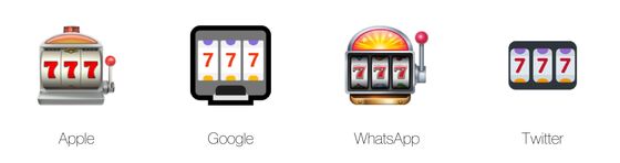
And, because each operating system gets to design how their emojis look, companies are free to plug their own products. Hence on a Mac the emojis for “mobile phone,” “watch,” “laptop,” “mouse” and “desktop computer” all illustrate Apple products.
In time, corporate logos will inevitably enter the emoji alphabet in their own right, becoming one more character in our lexicon of universal visual communication. At the vanguard of this movement is Twitter’s “hashflag” technology, which allows corporate sponsors and social campaigns to attach logos and emojis to hashtags. In this way, just as #NFL auto-suggests the NFL crest, and #Matrix a red and blue pill icon, so #BlackLivesMatter adds a trio of clenched fists and #MeToo a trio of raised hands.
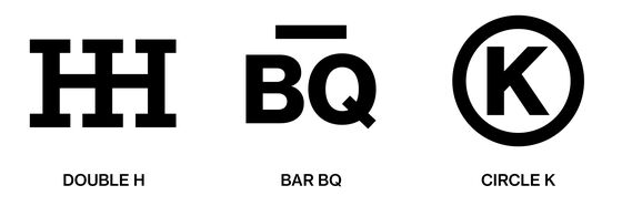
“Strange things are afoot at the Circle K”
For some groups the concept of a universal and symbolic form of commercial communication is as old as the hills.
“Brands are made up of letters of the alphabet, numerals, and designs of familiar objects such as animals, birds, and articles of commerce, all done in outline. Legitimate brands are recorded in order to protect their owners.”
— Fay E. Ward, The Cowboy at Work, 1958
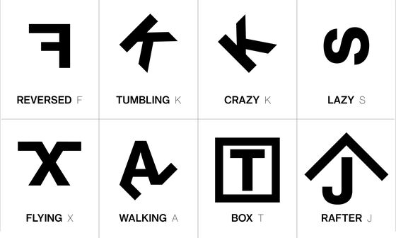
American cattle branding has a complex taxonomy. First, there are scores of graphical conventions about how letters, numbers and symbols are positioned and modified to create additional meaning. For instance, any character leaning forward is “tumbling” and leaning back is “crazy”; any letter on its side is “lazy”; and any letter back to front is “reversed.” In addition, characters can be modified with a range of shapes, including: lines, circles, boxes, diamonds, slashes, barbs and staples.
Once formed and combined these elements are then “called” (i.e. “read”) in a specific order — from left to right, from top to bottom, from outside in — to define the brand’s name:
Generations of cowboys have lived and died by this idiosyncratic taxonomy, which both transcends literacy and communicates ownership at a glance.
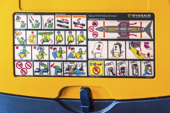
Cattle brands are the opposite of “chartjunk” and the epitome of “data-ink maximization.” And they remind us of three things essential to modern commercial identity: the need for clarity and simplicity; the space for personality and whimsy; and the understanding that the best communication is universal.
The word “maverick” derives from Samuel Augustus Maverick (1803–1870), a Texas politician and land baron who allowed his cattle to roam the Matagorda Peninsula unbranded. Opinion is divided as to why. Some say it was to allow Maverick to claim all unbranded calves as his own, others that it was an indication of his political independence, ranching indifference, or interest in animal welfare. In any case, some 150 years later, maverick remains the term for unbranded cattle, as well as those anxious to be seen as iconoclasts.
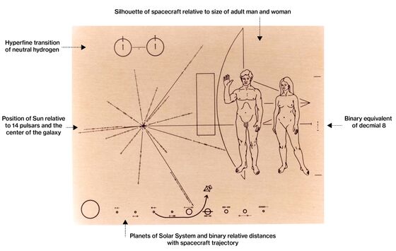
However, as commerce becomes ever more complex, cacophonous and even extraterrestrial, the new mavericks of branding may be those returning to the omniplatform and omnilingual principles of hot metal. This was the approach taken in 1972 by the designers of NASA’s “Pioneer Plaque” — a six-by-nine inch sheet of gold-anodized aluminum, engraved with the symbolic elements of human life on Earth — which was attached to the antennae of Pioneer 10 and 11, in case another spacefaring civilization ever intercepts the vessels.
One small step for brands … one giant leap for brandkind?
In The Hitchhiker’s Guide to the Galaxy, Douglas Adams introduced us to the “Babel Fish” —a small, yellow leech-like fish that, when placed in the ear, automatically translates all known languages. Interestingly, Adams was less optimistic than Zamenhof about the civilizing impact of seamless meaning: “Meanwhile, the poor Babel fish, by effectively removing all barriers to communication between different races and cultures, has caused more and bloodier wars than anything else in the history of creation.”
The timeline of emoji invention is disputed, and it seems that Softbank may have originated an earlier set in 1997. That said, “typographical art” and emoticons date back to the 1880s. Apple added an emoji keyboard to iOS 2.2 in 2008, but the rather clunky feature was limited to Japanese phones.
However well-intentioned, skin-tone variable emojis are not without complexities, asZaraRahman explored in her essay, “The problem with emoji skin tones that no one talks about.”
This column does not necessarily reflect the opinion of the editorial board or Bloomberg LP and its owners.
Ben Schott is Bloomberg Opinion's advertising and brands columnist. He created the Schott’s Original Miscellany and Schott’s Almanac series, and writes for newspapers and magazines around the world.
©2021 Bloomberg L.P.