(Bloomberg Opinion) -- Republican Florida Governor Ron DeSantis has been enjoying national attention in recent weeks — and even been touted as a 2024 presidential contender — because, as daily activities have gone back to more or less normal in his state, it’s apparent that Florida has weathered Covid-19 with less loss of life than the rest of the country (157 Covid deaths per 100,000 residents versus 170 nationwide). Meanwhile, California Democratic Governor Gavin Newsom, facing a Republican-led recall effort largely because of his stricter-than-average Covid policies, points to an even lower Covid death rate (151) as evidence that his approach has been a success.
Look at a map of Covid death rates by county, though, and you can’t help but wonder if this focus on governors and their policies is misplaced.
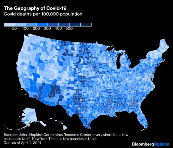
There are some exceptions such as neighbors Iowa and Nebraska, whose state lines stand out quite clearly on the above map (Nebraska’s in a good way, Iowa’s in a bad one). Also, like all Covid-related numbers, these are imperfect — I’ve detailed some of the limitations in a footnote. Still, the patterns here are to at least some extent reflective of reality, and they follow regional lines more than state borders.
In Newsom’s California, for example, the Covid-19 death toll in the San Francisco-Oakland-Berkeley metropolitan area has so far added up to 73 of every 100,000 residents. That’s only slightly higher than the rate in Israel, a country seen as pretty successful in fending off the worst of the pandemic. It’s not quite as low, though, as in two big metropolitan areas to San Francisco’s north, Portland-Vancouver-Hillsboro (53) and Seattle-Tacoma-Bellevue (66).
Farther south, California’s biggest metropolitan area, Los Angeles-Long Beach-Anaheim, has had a much tougher time of it, with 212 Covid deaths per 100,000 people. That’s worse than the official totals for all but three nations, although not all that much higher than the 183 deaths per 100,000 across the desert in the Las Vegas-Henderson metro area. Along the Mexican border in Imperial County, aka the El Centro metropolitan area, the 395 death rate is fourth-highest among U.S. counties of 100,000 or more inhabitants — just ahead of its neighbor across the Colorado River, Arizona’s Yuma County.
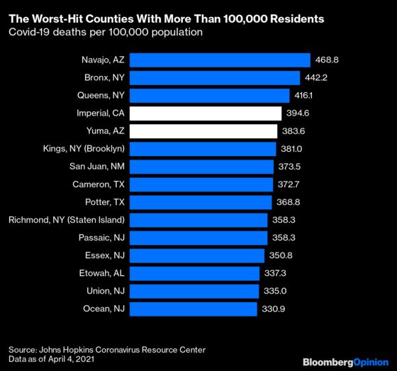
This ranking also makes clear the limitations of using a nationwide map of counties to visualize the phenomenon: hard-hit rural counties in the Deep South and Great Plains stand out on the map, while the physically smaller but far more populous counties in and around New York City account for a much bigger share of overall Covid deaths. The rankings of 100,000-plus-population counties with the lowest death tolls, on the other hand, accord pretty well with what you see on the map. The Far West, especially the Northwest, really has been pretty successful in fending off the pandemic (so has northern New England, but not nearly as many people live there).
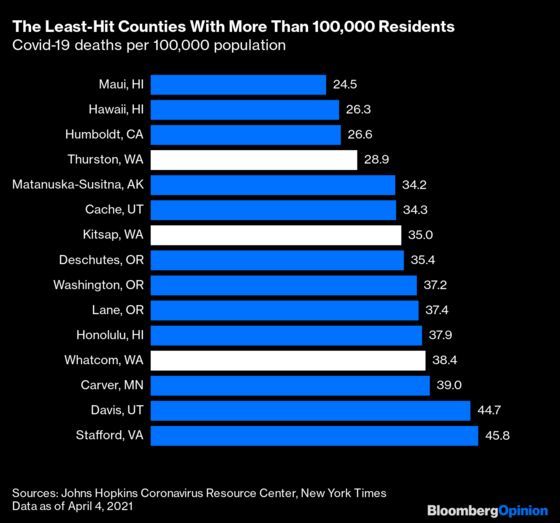
A lot of these counties owe at least some of their success to their isolation: Hawaii and Alaska aren’t contiguous with the rest of the country, and Humboldt County in California (main city: Eureka) and Deschutes County in Oregon (Bend) are separated from the rest of civilization by rugged mountain ranges and vast expanses. But the three Washington counties in the above chart are all adjacent to the Seattle metro area, location of the first big outbreak of Covid-19 in the U.S., or at least the first to be detected. If there’s any governor who should be getting positive attention for his or her pandemic policies it’s Washington’s Jay Inslee. Still, even Washington doesn’t look much different from Oregon and Northern California on the above map.
So what does determine an area’s success in staving off Covid-19, or its susceptibility to it? Many empirical studies have attempted to link local policy choices with the spread of the disease, although a recent assessment by a large group of epidemiologists and statisticians identified only four such studies that stand up to serious statistical scrutiny. Those four all focused on the shelter-in-place orders imposed early in the pandemic, and found them to be effective in reducing Covid incidence in some circumstances and less so in others. Lockdowns were more effective in urban, high-income and high-Covid-incidence areas than in rural, low-income and low-incidence ones, and more effective the earlier they were imposed.
Pre-existing conditions may be as important as the policies. With that in mind, I engaged in an exercise that surely wouldn’t stand up to serious statistical scrutiny but might be somewhat informative: placing the Covid death rates for all the nation’s counties alongside various metrics derived from the Census Bureau’s 2015 through 2019 American Community Surveys (for many smaller counties such data are only available as five-year averages) and running Excel’s correlation function.
Correlation is measured on a scale from negative one to one, with zero signifying no correlation and anything between -0.5 and 0.5 considered very weak. The strongest correlations I found with county Covid death rates were -0.35 for the percentage of those 25 and older with high school degrees and higher, and -0.33 for bachelor’s degrees and higher. That is, the greater the share of a county’s adults with high school or college degrees, the lower the Covid death rate. Past surveys have found a close link between education level and the ability to work remotely, which may have played a role here. People with more education may also have taken Covid more seriously, especially early on. But again, the signal is quite weak.
The only other correlations I found that even broke 0.2 were with the percentage of a county’s population that was Black (0.23) and median income (0.21). Falling short of that low hurdle were other racial and ethnic population shares, share of population 65 and older, population density, overcrowding (as measured by the percentage of households with more than 1.5 persons per room), and the share of employed people who worked full-time from home (again, these are 2015-2019 data; such numbers aren’t available yet at the county level for 2020, when far more people worked remotely).
The main lesson here may be one of humility. On an international level some nations (almost all on the Pacific Rim) clearly owe much of their success in avoiding Covid deaths to government policies, among them closed borders. Within the U.S. it’s a lot harder to say for sure why some places have been devastated by the pandemic and others have not. It’s definitely not all about the governors.
The numbers are collected by the Johns Hopkins Coronavirus Center for Systems Science and Engineering from state and local health departments, and there may be differences across jurisdictions in how strict or expansive they are in attributing deaths to Covid-19. There are also some reporting quirks: the Hopkins database reports Covid deaths in most of Utah by groups of counties rather than individual counties, although I was able to fill in the blanks there with data from the New York Times. A few states (Illinois, and to a lesser extent Georgia and Indiana) have reported significant numbers of deaths that aren't assigned to a county, which results in some underreporting on the county map, as does the fact that inMissouri Kansas City reports deaths separately from the four counties in which it is located. Also, the pandemic's not over!
This column does not necessarily reflect the opinion of the editorial board or Bloomberg LP and its owners.
Justin Fox is a Bloomberg Opinion columnist covering business. He was the editorial director of Harvard Business Review and wrote for Time, Fortune and American Banker. He is the author of “The Myth of the Rational Market.”
©2021 Bloomberg L.P.