(Bloomberg Opinion) -- The quintessential irony of “Keep Calm and Carry On” is that the posters were never used. Although millions were printed on the eve of war, because the slogan was designed to pacify Britain should the Nazis invade, the poster remained largely unknown until a copy was unearthed by a Northumberland bookseller in 2000 after which, as he said, “all hell broke loose.”
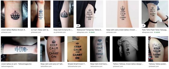
Generations after its creation, “Keep Calm” still spins a golden thread of Britishness — a stiff-upper-lip, make-do-and-mend, dig-for-victory, mustn’t-grumble, tea’s-up, nanny-knows-best, mind-the-gap, be-lucky, cheer-up-luv, worse-things-happen-at-sea thread that somehow unites the Blitz Spirit and the Great British Bake Off.
Nostalgia aside, however, the improbable longevity of “Keep Calm and Carry On” owes much to the poster’s messaging clarity and design elegance — two attributes glaringly absent from the current government’s Covid-19 communications, as evinced by a sample of official offerings:
- Cluttered layouts, chaotic color schemes and random typefaces:

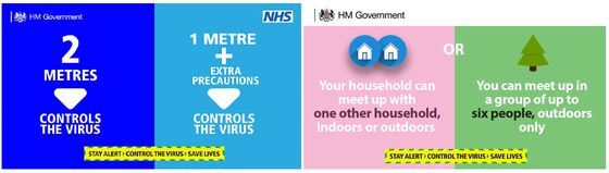
- Multiple stock visuals for the same message:

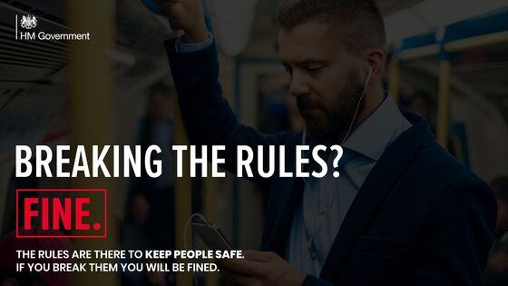
- Jarring juxtapositions of the official, the scientific and the casual:

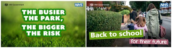
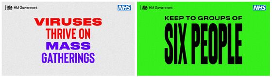
- Illegible text, haphazard spacing and eccentric colors:
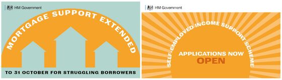
- Disconnected slogans and inconsistent tags:

- Ham-fisted takes on “hipster” aesthetics (with an awkwardly euphemistic slogan):

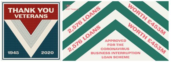
- An obsession with the rhetorical “rule of three” (there are five triads in this one design):

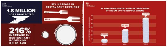
- “Chart-junk” info-graphics:
- Incomprehensible conceptual overreach:
- Baffling clarification:

- Platitudinous gibberish:
- And efforts that scream of a Sunday night school project:
Perusing this dog’s dinner, the most charitable viewer might conclude, at best, that the Whitehall wonks are toying with a highly evolved form of “low-fi” agitprop — a state-sanctioned “shit-posting” strategy calculated to generate online traction and LOLZ. The grim reality, however, is probably a basement of interns armed with PowerPoint and stock photography.
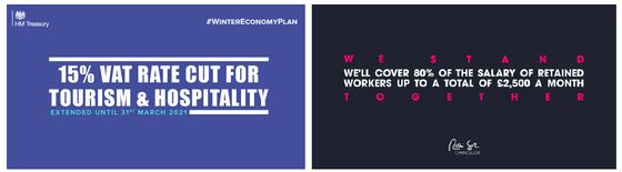
To be fair, the government did enjoy a messaging hit with the launch of its initial Covid campaign in March:
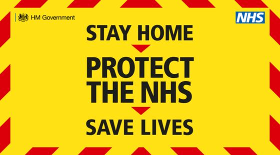
Although neither poetic nor elegant, “Stay home, Protect the NHS, Save lives” was a simple, blunt and urgent message that justified its autocratic demand with an appeal to the common good. And it worked: According to government figures reported by Campaign, after two months “spontaneous and prompted awareness of the campaign were 77% and 92% respectively” and “83% of people understood how their own behaviour can affect the spread of coronavirus.”
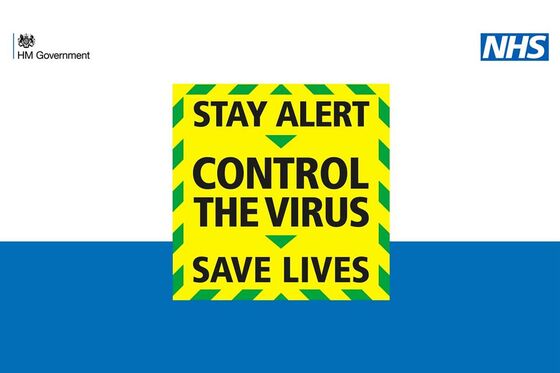
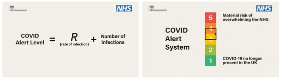
If “stay home” was a silver bullet, “stay alert” was a damp squib — generating confusion and derision in equal measure, and marking the moment where the government lost control of its messaging and the public mood. The mystery of what staying “alert” might involve was exacerbated by a bizarre televised address during which Boris Johnson unveiled a five-step “Covid Alert System,” based on a formula which set the level at … 3.5.

Of course all campaigns are open to parody, and pastiche can prove a message has entered the mainstream, but derision of pandemic health guidance suggests something is seriously awry. Within hours of the prime minister’s statement, the comedian Matt Lucas tweeted an instantly viral video response:
“So, we are saying: don’t go to work, go to work, don’t take public transport, go to work, don’t go to work, stay indoors, if you can work from home go to work, don’t go to work. Go outside, don’t go outside. And then we will, or won’t, something or other.”
So skewering was this 17-second hit that, five months later, one pollster reported it “has been mentioned in every focus group on coronavirus my firm has run since May.”
In July, the government launched yet another tricolonic slogan with an incongruous new color scheme, and instantly perplexing typography:
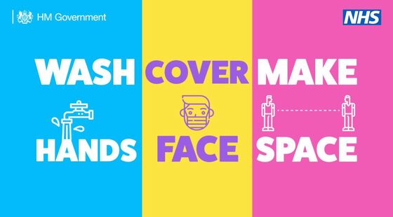
Even after “wash cover make hand face space” had been decoded, the message, as Jemima Kelly noted in the Financial Times, was legally inconsistent:
“These three commands are not equal. One of them constitutes a criminal offence if it’s breached in certain contexts (not wearing a mask on public transport, unless you have a “reasonable excuse”); the others are just advice.”
It was certainly visually inconsistent:
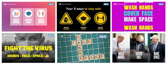
And quite possibly medically inconsistent, as the virologist Julian Tang told The Guardian:
“… they have got that hand, face, space message the wrong way round. It should be space first — and by a long stretch. Then think about your hands and face. Until we get that right we are going to continue to be in trouble.”
In October, as Covid ticked up ominously, the government launched a three-tiered local alert regime:
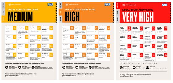
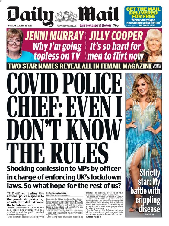
If Twitter mockery of any new campaign was to be expected, the criticism of senior police officers was not:
“We had got to a position where the regulations were fairly clinically clear and it was really clear what you could not do … What we have seen with the tiering is a reintroduction of a mixture of both things that you cannot do under regulation and guidance, and the tiering relates to both. Unfortunately, what that has done is confused the messaging again.”
This exasperation was echoed by the epidemiologist John Edmunds: “The most difficult thing to predict is government behavior.” Not what you want to hear from a government advisor after eight months and 45,000 deaths.
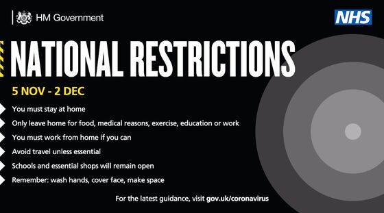
At the end of October, after weeks of ridiculing the idea, the government announced a month-long national lockdown, deploying a meaningless bullseye motif and a color scheme that combined “medium-tier” yellow and funereal black.
Adding insult to this messaging injury is Britain’s history of superlative design. There aren’t many golden ages, but there was a golden age of government propaganda, beginning in World War One (with Alfred Leete’s “Your country needs you”) and reaching its zenith during World War Two. Here, unpopular rules and calculated appeals were communicated by a roster of supremely talented graphic artists who helped shape the national mood.
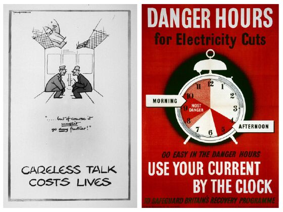
It’s clear that the current government admires this golden age, if only because they occasionally fail to ape the wartime aesthetic.
The challenge of graphically communicating complex and controversial messages — while seldom straightforward — is rarely insurmountable. Designers are regularly tasked with explaining the thorniest of issues in ways that inform and persuade, and they find their solutions by deeply interrogating the problem — a process that often challenges and sometimes changes the client’s own perception of its aims.
Any graphic designer will tell you: The secret to great work is a great client. Just as any good doctor will tell you: A physician who treats himself has a fool for a patient. Faced with the toughest communications challenge in decades, the British government proved both of these maxims true.
It’s hard to fathom what caused such sustained mediocrity: ignorance, arrogance, a Govian rejection of expertise or sheer incompetence:
The blustering John Bull who, week after week in his Telegraph column, lambasted “the namby-pamby, risk-averse, mollycoddled airbagged approach that is doing so much economic damage to Britain” now finds himself enforcing the most Draconian lockdown in British history; you can see how Falstaff would relish a Fleabag-esque wink to camera.
Johnson’s cakeism helps explain not only his messaging chaos, but why he declined to censure his senior advisor, his father or even himself for confusing lockdown; why he repeatedly failed to explain his own rules; and why, when asked if he would report neighbors breaking pandemic laws, replied: “I have never much been in favour of sneak culture, myself.”
Democracies have two levers of power — persuasion and coercion. In theory, they deploy the latter only after exhausting all reasonable attempts at the former. Amateurish design, stock images, childish graphics and meaningless slogans don’t make official messages somehow more “approachable.” They erode the claim to competence upon which democratic leaders rely before nudge comes to shove.
As instructions become more complex, penalties become more punitive and conditions become more perilous, so design becomes more critical — a reality recognized in April by the Health Secretary Matt Hancock:
“How we communicate as a government, as ministers, has a direct impact on the amount of cases that we have and therefore the amount of people who die.”
***
Note: I have not explored the “scientific” data visualizations shown during Downing Street’s televised Covid briefings – despite their complexity, illegibility, opacity and fleeting visibility.

Although these graphics could – and should – have been redesigned for public consumption, it’s possible to view them as the government merely “showing its working,” and not as a serious attempt to explain statistical trends or competing epidemiological models. That said, the Office for Statistics Regulation recently reprimanded the government’s Chief Scientific Advisor, stating: “The use of data has not always been supported by transparent information being provided in a timely manner. As a result, there is potential to confuse the public and undermine confidence in the statistics.”
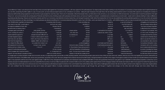
Those steeped in Downing Street Kremlinology will note that both Boris Johnson and Rishi Sunak have begun to sign their posters. Such personalization of policy not only bucks the convention of collective Cabinet responsibility, it risks balkanizing the government’s appeal to unity. One of the design triumphs of “Keep Calm and Carry On” was its use of the Crown to proclaim a national, nonpartisan effort; infantile signature turf-wars seem antithetical to this noble aim.
Abram Games, James Fitton, Phillip Zec, Fougasse (Cyril Kenneth Bird), Donia Nachshen, to name but a few.
This column does not necessarily reflect the opinion of the editorial board or Bloomberg LP and its owners.
Ben Schott is a Bloomberg Opinion visual columnist. He created the Schott’s Original Miscellany and Schott’s Almanac series, and writes for newspapers and magazines around the world.
©2020 Bloomberg L.P.