(Bloomberg Opinion) -- Which part of the U.S. wealth distribution saw its net worth rise the fastest over the past year, five years and decade? No, not the top 1%, according to the distributional financial accounts published last month by the Federal Reserve.
The rich had a great run, but they didn’t even come close to the percentage gains in real wealth seen by the bottom 50%. These amounted to 21.9% over the past year, 125.6% over five years and 526.2% over 10 years, compared with the one-percenters’ 10.3%, 33.8% and 83.9%.
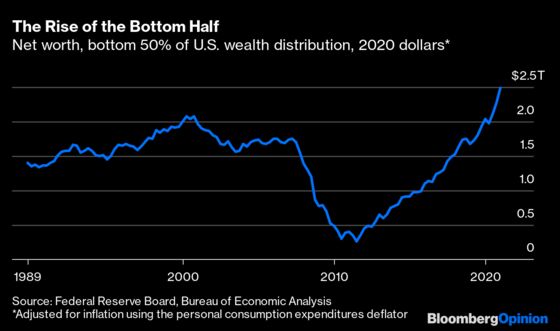
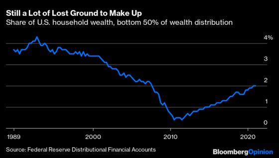
This is partly a reflection of how awful the 2007-2009 recession and its aftermath were for the less-affluent half of Americans. Even after the gains of the past decade, the bottom 50% control only 2% of U.S. household wealth, lower than at any time on record before 2007.
One can thus just as easily tell a discouraging story with this data as an encouraging one. Media coverage of the quarterly distributional-accounts releases tends to emphasize the continued gains at the very top, and even when Niskanen Center economist Ed Dolan focused on the lower 50% for an essay early last year in the Milken Institute Review, it was headlined “The Bottom Falls Out for the Bottom Class.”
Dolan was taking the long view, focusing on how much ground the less-wealthy half of Americans had lost in 1990s and 2000s. He was not wrong to do so. But with another year-plus of data, the comeback of the bottom 50% is starting to look big and sustained enough that maybe we should start paying attention to it. (When I emailed him about it, Dolan agreed that it’s “interesting,” although he and other economists seem to be only beginning to look at it.)
The Federal Reserve only started publishing its distributional accounts in 2019, following on recent work by economists Thomas Piketty of the French School for Advanced Studies in the Social Sciences and Paris School of Economics, and Emanuel Saez and Gabriel Zucman of the University of California at Berkeley. Government measures of inequality have long focused on income rather than wealth, mainly because there’s lots of income data available from tax returns and Census Bureau surveys. To estimate the wealth distribution, the Fed combines household-level data from its triennial Survey of Consumer Finances with aggregate data from its quarterly Financial Accounts of the United States.
This indirect approach helps explain why the entire bottom 50% of the wealth distribution is lumped together (the other categories are the 50th to 90th percentile, 90th to 99th and top 1%). The Fed simply does not possess enough information about the balance sheets of less-affluent households to get much more granular than that. It is able to slice things by income quintile, though, and the differing trajectories of the bottom three quintiles hint at some of the drivers behind the wealth gains of the bottom half.
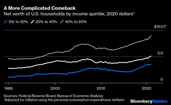
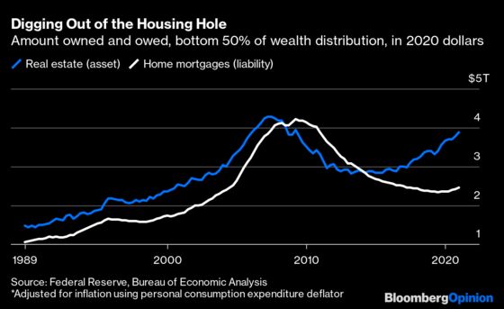
Note that big rise and fall in the 2000s in the middle of the income distribution (40% to 60%), which is less apparent for the next quintile down and far less so for the bottom one. That was the housing bubble and bust, and the bulk of the recent fall and rise in net worth among the bottom half of the wealth distribution can probably be chalked up to its impact on the more affluent part of that bottom half. From mid-2008 to the end of 2013, the less-wealthy 50% of Americans was collectively underwater on its mortgages. Now it has more home equity than ever.
It’s worth pausing for a moment to contemplate that a given household doesn’t always occupy the same part of the income and wealth distributions. In the early 2010s, for example, a fair number of households in the top half of the income distribution had negative net worth because the value of their homes had fallen so much. Households also don’t necessarily stay in the same part of either distribution from year to year.
For now let’s assume, though, that there is significant overlap between the bottom 20% of the income distribution and bottom 20% of the wealth distribution and significant continuity over time in both, and consider what has happened to these people over the past decade. They’re less likely to be homeowners so their wealth didn’t plummet during the housing bust, but it kept declining in the 2010s long after that of the next two income quintiles started rising. It finally stabilized in 2015, and then took off starting in 2016. The statistics on wage growth maintained by the Federal Reserve Bank of Atlanta make clear what happened:
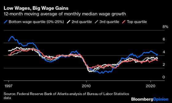
Early in the last recovery, low-wage workers saw the lowest wage gains. But in May 2015 their wage gains began outstripping those of higher-wage groups. As the data from the late 1990s makes clear, this is not unheard-of deep into an economic expansion, although it’s telling that it barely happened in the 2000s. Those favorably inclined to the Trump administration also credit the 2017 tax cuts, while those less-favorably inclined point to the minimum-wage hikes enacted by dozens of states and localities since the beginning of 2014. They may both be right.
While the chart above indicates that these gains continued in 2020, that’s misleading because so many low-wage jobs disappeared during the pandemic. Indeed Hiring Lab director of research Nick Bunker, who maintains a similar tally of wage gains in lower-, middle- and higher-wage industries, says employment has fallen 9.9% in lower-wage industries since February 2020 versus 2.8% in higher-wage ones.
But something else came along in 2020 to bail out many of the people affected by those job losses: the Coronavirus Aid, Relief, and Economic Security Act with its unprecedented $1,200 checks for adults with incomes of $99,000 or less and $600 weekly boost to state unemployment payments. Subsequent relief bills passed in December and March should continue to boost the finances of less-wealthy Americans this year.
So that’s three drivers: (1) recovery from the housing bust, (2) late-cycle wage gains that probably got a boost from deficit spending and minimum-wage hikes and (3) checks from Washington. Other factors at work could include the end of the China shock for U.S. manufacturing, the virtual halt to illegal immigration after 2010, demographic change and who knows what else. Let’s hope the comeback of the bottom 50% continues long enough for economists to have lots of time to develop explanations for it.
Economist Edward Wolff of New York University has been compiling data on the U.S. wealth distribution for decades, but the engagement of the all-star trio of Piketty, Saez and Zucman seems to have lent new urgency to the effort.
This column does not necessarily reflect the opinion of the editorial board or Bloomberg LP and its owners.
Justin Fox is a Bloomberg Opinion columnist covering business. He was the editorial director of Harvard Business Review and wrote for Time, Fortune and American Banker. He is the author of “The Myth of the Rational Market.”
©2021 Bloomberg L.P.