Methodology: Inside Bloomberg’s Covid Resilience Ranking
Bloomberg’s Covid Resilience Ranking has scored the largest 53 economies on their success at containing the virus.

(Bloomberg) -- Everyone is battling the same coronavirus, but quality of life, control of the pathogen’s spread and progress toward reopening look vastly different across the world.
Bloomberg’s Covid Resilience Ranking scores the largest 53 economies on their success at containing the virus with the least amount of social and economic disruption. As more places deepen their reopening efforts amid rising vaccinations, the progress of normalization in global travel routes and flight capacity remains a key indicator, having been taken into account since June 2021.
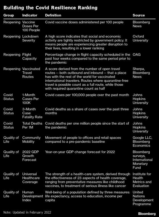
In devising the Ranking -- which launched on Nov. 24, 2020 -- we considered many datasets, indicators and indexes produced by organizations around the globe and applied three fundamental criteria in whittling the list down to the 11 components that make up the current measure:
- How complete is the data? Many relevant indexes and databases -- for instance, measures on trust in government -- cover only a small number of places. We focused on indicators that cover the vast majority of the 53 economies in the Ranking, filling in the gaps with substitutions where reasonable.
- How current is the data? All datasets have a lag, some of up to a few years. Because of the pandemic’s pace and transformational impact, we chose to use the most up-to-date datasets where possible, with the maximum lag of about one year at the start of the Ranking. Eight of our indicators are refreshed daily, one is weekly, and two are annual figures.
- Who collects the data? We decided to only use data compiled by Bloomberg or indicators from reputable third-party organizations with a track record of collation and analysis.
Why rank only 53 places?
We decided for brevity and relevance to limit the Ranking to economies valued at more than $200 billion prior to the pandemic.
How often do you update?
The Ranking story is updated monthly, usually in the last week of every month.
How is the Ranking aggregated?
Each of the 11 data indicators are aggregated through the “max-min” method, which is used to convert metrics expressed in different scales into a common one, while maintaining the relative distance between values.
All the indicators are scored on a 0-100 scale, with 100 (blue) indicating the best performance and zero (orange) the worst. The rest fall in between, scaled by their distance from one another. The final Bloomberg Resilience Score is the average of a place’s performance across the indicators, equally weighted.
The final score given to each place is a relative measurement on a given date. That score shouldn’t be compared in isolation to the economy’s previous scores as the max-min ceiling and floor values change in every update.
What is the Reopening Progress tab about?
Where infections, deaths and the capacity of a health-care system to cope were once paramount, now the ability to essentially turn back the clock and return to open, pre-Covid times is also taking on significance.
Until early 2021, being in a place that had stamped out local virus transmission in part by shutting out the world was one of the best outcomes. But with more and more places taming serious disease and fatalities through vaccination, progress in safely lifting restrictions on social and business activity -- including global travel and tourism -- is now an important factor in an economy’s pandemic performance.
Hence in the June 2021 Ranking we introduced the Reopening Progress tab, with four indicators that help measure a place’s path toward opening up to the wider world. The bucket includes two metrics that have been in the Ranking for some time -- Vaccination Progress and Lockdown Severity -- and two brand-new datasets, Flight Capacity and Vaccinated Travel Routes.
What is measured with Flight Capacity?
Bloomberg publishes a flight tracker based on data from flight-monitoring firm OAG. The new Ranking metric draws from this, calculating the provision of plane seats in each place in the latest available four-week period compared with the same period prior to the pandemic between February 2019 and January 2020.
The data combines domestic and international flights, rewarding larger economies where local travel has made up for the plunge in global air traffic. Mainland China was the top scorer in this indicator, until its variant-driven outbreaks at the end of 2021 and into 2022, with strong domestic travel momentum as the population was prevented from vacationing overseas.
Conversely, small, travel-reliant economies like Hong Kong and Singapore which don’t have domestic air travel markets are typically among the worst scorers.
How is Vaccinated Travel Routes calculated?
It’s not an easy task to quantify the openness of a country in a fast-moving pandemic. Bloomberg collaborated with data provider Sherpa, whose collation of information on travel restrictions is used by companies like Wego Pte Ltd., Expedia Group Inc and American Airlines Group Inc.
We used Sherpa’s underlying database to create a measurement of how many open travel routes -- both outbound and inbound -- a place has with the rest of the world for vaccinated people. Routes where quarantine-free travel is possible count as a full route, while those which require quarantine count as half.
Some places still bar all travelers and only allow residents to enter their borders, which we don’t consider an open route.
In the scoring, we only look at entry restrictions on the destination end to determine the openness of a route. Some places have exit restrictions barring residents from leaving the country, but we don’t take these into account as the indicator aims to track non-resident movement.
Outbound and inbound travel are considered two separate routes, underscoring the complexity of navigating travel to an open place if one lives where borders are still closed. Travel restrictions are also not always reciprocal, with tourists from low-infection places welcomed in many places, though the place itself bars the vast majority of travelers.
The scoring does not take into consideration testing requirements, as pre- and post-flight testing is now commonplace and easily accessible, unlike quarantine and isolation mandates. It also does not factor in vaccine types that are currently required by various jurisdictions, given that governments are moving toward standardized recognition of the most widely-used vaccines globally.
With 242 jurisdictions tracked in Sherpa’s database, this indicator’s maximum theoretical score is 482 routes -- for a place which allows all quarantine-free vaccinated travelers to enter, and whose vaccinated travelers are welcomed by every other place. None of the ranked places have ever reached the maximum score.
What are you measuring with the Vaccine Doses Per 100 People indicator?
This metric that captures vaccine access has been repeatedly refined as progress on the ground becomes clearer. In November 2021, the People Covered By Vaccines indicator was replaced by Vaccine Doses Given Per 100 in accordance with the shift in Bloomberg’s Vaccine Tracker.
The previous indicator approximated the percentage of a country’s population that is fully inoculated by taking into account total doses administered and the mix of vaccine types. Given that some vaccines require three or two doses and some just one, this method of calculating coverage allowed dosage differences to be recognized where data is available.
Yet as more countries start rolling out booster shots, this method of calculation risked marking those getting their third shots as newly vaccinated. Thus, the metric of Vaccine Doses Per 100 People became a better mirror of the real-world situation. Given the limited use of single-dose vaccines in the world, the change of methodology basically doubled the figure for most countries without affecting differences in scale. The metric shift therefore had no material impact on the Ranking’s consistency.
In earlier versions, the Ranking also included an indicator tracking vaccine supply agreements, named Access to Covid Vaccines. In March 2021, we retired this metric, given that distribution is proving far more important than deals signed. Below is a table capturing how the vaccine access indicators have changed since the Ranking’s debut in November 2020.
| Edition | Vaccine Indicator(s) |
|---|---|
| November 2020 | Vaccine supply was represented by an indicator called Access to Covid Vaccines. This tracked the number of supply agreements each place had signed based on information compiled by Duke Global Health Innovation Center and Bloomberg |
| December 2020 | As governments disclosed more information on their negotiations and order sizes, Access to Covid Vaccines was fine-tuned with a Bloomberg tracker that collated contracts and what percentage of a place’s population is covered by its deals |
| January 2021 | As vaccine rollouts started in some places, a new indicator -- Doses Given Per 100 -- was introduced as an additional metric |
| March 2021 | With the progress of distribution proving more important than supply deals, the Access to Covid Vaccines metric was removed and the Ranking reverted to 10 indicators, with vaccine access represented by People Covered By Vaccines |
| November 2021 | As booster rollouts started in many places, the Ranking reverted to using Doses Given Per 100 as its sole vaccination metric. |
What does Lockdown Severity measure?
This indicator is based on an index produced by the University of Oxford, which assesses the number and strictness of government policies that limit people’s social contact as a way of containing spiraling outbreaks.
We’re interpreting restrictive government policies as a negative in the Ranking as the stricter the lockdown, the more disruption people are experiencing. A higher score on Lockdown Severity denotes a less advantageous performance.
Two years into the Covid crisis and with vaccination having a game-changing impact, the need to impose lockdowns reflects a failure to progress, and so we’re scoring it accordingly.
Stringent restrictions also correlate with the mental and economic toll of the virus on a population. Social disruption and isolation have been linked to higher suicide rates in some places, while school closures have raised concerns over child development and increases in hunger and drop-out rates among disadvantaged families.
The index was updated in March 2022 by the University of Oxford to evaluate restrictions for the vaccinated and unvaccinated separately, with the two scores then being aggregated based on each country or region’s immunization progress sourced from Our World in Data. Prior to this change, the Lockdown Severity indicator showed only the strictest rules applied in each economy, which often only targeted the unvaccinated.
Does Lockdown Severity reflect conditions across an entire economy?
The Oxford University index reflects the most stringent conditions in place anywhere in a given economy. That means a lockdown in one city or area can be the basis for an economy’s overall score.
This naturally penalizes large, expansive countries like China and the U.S., where conditions can vary greatly from region to region and city to city. It also affects smaller places with a devolved system of government: for example, the U.K.’s conditions were still scored in the middle range in July’s Ranking despite England’s “Freedom Day” on July 19, 2021, because restrictions remain in Scotland and Wales.
Similarly, China’s conditions have generally been scored as stringent in most editions of the Ranking because some cities or districts were under targeted lockdowns as local officials fought virus flareups. But the majority of China’s 1.4 billion-strong population face barely any limits on their movement until the omicron variant entered its borders.
While imperfect, we view Oxford’s economy-wide approach as a proxy for how aggressively governments are likely to react if an outbreak emerges. China’s playbook has been to impose some of the most oppressive measures in the world, from bans on people in specific areas from leaving their homes to mass, obligatory testing.
Can Covid-19 data be trusted?
Under-detection, under-reporting and manipulation of virus data on cases and deaths have been recurring issues across many economies during the pandemic.
In most places, gaps in the data are largely due to the chaotic and fast-moving nature of the crisis: the supply of test kits has been inadequate, leading to under-detection of cases. Official death tolls are also likely to be under-reported due to people dying at home before being diagnosed, lags in reporting from overwhelmed hospitals and Covid-19 deaths being recorded in some places as due to other causes.
Countries like Spain, the U.S., China and Turkey have adjusted their numbers throughout the pandemic, and credible reports have emerged that some nations, including Iran, Brazil and Russia, have intentionally concealed or downplayed data. Beyond that, excess mortality in some economies -- the additional number of deaths overall compared to previous years -- has outstripped official Covid-19 death tolls.
Still, given that it’s hard to distinguish between slow reporting, inadequate resourcing and the intentional concealment of data, we’re using cases and deaths data compiled by Johns Hopkins University, which draws largely from government sources, with the awareness that this is likely not the full picture.
In recent months, several places have also made sizable adjustments to their death tolls due to backlogged data. While some specify the dates these previously unrecorded deaths correspond to, others don’t -- resulting in unusual surges in daily death counts as older fatalities are included. To avoid skewing the 3-Month Case-Fatality Rate indicator, we’ve taken out the predated deaths that happened before the current month where possible for places like Peru and Romania, while reflecting these backlogged deaths into the overall mortality metric -- Total Deaths Per 1 Million -- to accurately assess the cumulative impact.
A note on China’s numbers, which have been called into question by the U.S. and others. Throughout the pandemic, the country has repeatedly adjusted its virus data, adding nearly 15,000 new cases in one day in mid-February 2020 and raising its overall death toll by 40% to 4,632 in April 2020. These revisions arguably make its latest numbers more reliable. Researchers have used fraud detection techniques to conclude that, while China did manipulate its data in the early stages of the pandemic, its numbers have been accurate since.
Why do you have two datapoints on virus deaths?
The case-fatality rate is a good indicator of whether a place is effectively treating infected people and preventing Covid-19 deaths, a fundamental aspect of containing the virus. Over time, this ratio has improved among mostly developed economies as doctors and hospitals learned how to better fight the coronavirus.
The rate also captures the point economies are at on their individual pandemic curves. Australia had a high case-fatality rate during a brutal southern hemisphere winter wave in 2020 that triggered a three-month lockdown in the country’s Victoria state. Once that outbreak largely quelled in December, the rate has fallen to a relatively low level. Correspondingly, the case-fatality ratios for nations in the northern hemisphere have deteriorated after they entered the cold season.
Prior to July 2021, the Ranking looked at trailing one-month data for this metric. In that edition, we shifted to three months in calculating the case-fatality rate to smooth out occasional volatility caused by the lag between the onset of the disease and the outcome of death or recovery. We see this shift as warranted because at this point in the pandemic improved testing and treatment conditions have made the time lag between the surge in cases and corresponding deaths longer. Three months also better captures how long an infection wave generally lasts in any place, making it a better proxy for how many cases end in death.
The case-fatality rate doesn’t, however, capture the scar that the pandemic leaves on an economy as a whole, especially in places like Belgium, Sweden, Italy, the U.K. and the U.S., where Covid-19 cut a swathe through elderly populations in its initial phase. A higher percentage of Sweden’s population died from the virus than Vietnam’s, even if Sweden’s ability to save the lives of Covid-19 patients has since improved. This is why we’ve also included an indicator that reflects cumulative Covid-19 deaths as a share of the total population: Total Deaths Per 1 Million.
As the world moves in the direction of reopening, it’s also important we keep this accumulative metric that reflects the grim personal legacy of Covid on each economy.
Economies with older demographics generally rank lower on this measure, given the way the virus can rip through aged-care homes. Hong Kong, which ranks last in March 2022, saw its number of Covid-19 deaths per million people become the world’s highest, driven by an under-vaccinated elderly population and outbreaks in nursing homes.
Why was Positive Test Rate removed as an indicator?
The Positive Test Rate indicator -- collated by Our World in Data -- was a component in the Ranking from its debut in November 2020 to January 2022. In February 2022, we removed it, leaving the Ranking comprised of 11 datapoints. As more and more countries shift to treating the virus on a similar level to influenza, testing for Covid has become limited in places like Norway, the Netherlands and Sweden, which now only test those who are ill or at risk. We expect most other places to follow suit in minimizing testing. In an era of high vaccination and normalization, the rate is no longer the red flag that it used to be.
Before widespread vaccination allowed places to pivot to treating Covid as endemic, the positive test rate was considered by experts as the most reliable way to determine if a place is testing enough. A high rate of virus tests coming back positive indicates authorities are probably only testing the sickest patients who seek out medical attention and are not casting a wide enough net. It’s a sign there is likely to be undetected infections in the community.
What does Community Mobility show?
Given the broadness of the Lockdown Severity indicator, and the fact it reflects government policy and not its impact, we sought out another datapoint to better capture this picture. Google’s Covid-19 Community Mobility Reports, which underpins our Community Mobility measure, tracks people’s real-time movements and helps round out our understanding of how they are responding to virus restrictions in their everyday lives.
We track movement to and from retail, recreational and work places, taking a 30-day average to smooth out the effects of holiday periods. The closer movement levels are to the economy’s pre-pandemic baseline, the higher the score on this datapoint as part of Bloomberg’s Ranking.
Places where Stringency and Mobility scores are at odds reflects a lack of official ability to enforce restrictions, and a lack of compliance among the population.
As Google data is not available for mainland China, we substituted with a tracker created by Bloomberg Economics -- used in a weekly analysis of activity in 26 major economies -- to derive China’s corresponding score. The correlation between Google’s data and Bloomberg’s daily activity tracker for the other 25 economies is high, giving us confidence in using it as a substitute for China.
Google doesn’t track mobility data for Iran. Since there is no viable alternative data source for mobility in Iran, it doesn’t have a score for this indicator.
Google’s data compares the current mobility level in certain venues against a set historical baseline prior to the pandemic. But the historical baseline could have been affected by non-Covid events at the time, such as civil unrest or military action, and circumstances like population change have also shifted over the past two years. Hence from January 2022, the Ranking removes Google Mobility data for places that have become outliers in the dataset. In April, Iraq, Bangladesh, Pakistan and Nigeria do not have scores for this indicator as they exceed the range of a box-and-whisker chart, a statistical tool used to identify outliers.
What does the GDP measure track?
When we first launched the Ranking in November 2020, this indicator was based on the International Monetary Fund’s annual gross domestic product forecasts for 2020. The greater the expected contraction, the more challenging the economic reality is for people in these places, and therefore the weaker their performance on this measure.
In 2021, we swapped out the IMF’s forecasts for a consensus figure compiled by Bloomberg from economist surveys, as this is more up-to-date than the IMF’s quarterly-updated number. For places with less than five economist forecasts, we revert to the IMF’s latest-available estimates instead. This is routinely done for Bangladesh, Iran and Iraq.
Our GDP measure reflects the percentage contraction or expansion projected this year in the 53 economies covered. We chose to use this indicator, despite its bias toward emerging, high-growth economies, instead of the “swing” between the current forecast compared to the pre-pandemic figures. This is because the Ranking aims to show the best places to be right now, not just how well they’ve deflected the economic blow from Covid-19.
In January 2022, we refreshed this indicator to reflect projections for the year ahead. For India, the forecast used refers to the year ending March 31, 2023, in alignment with the government’s fiscal cycle.
Why is the state of pre-pandemic health care relevant to Covid-19?
The Universal Healthcare Coverage indicator draws from a 2019 dataset published by the Institute for Health Metrics and Evaluation published in the Lancet in August 2020. It maps the effectiveness of 23 preventive and treatment measures, ranging from access to basic non-Covid vaccines to cancer care.
While the dataset was produced prior to the onset of the pandemic, it reflects an economy’s ability to effectively prevent, detect and treat illness across a population. Bloomberg’s deduction is that places with higher scores on this measure are in a better position to prevent deterioration and death in Covid-19 patients, and more able to maintain the provision of non-Covid related healthcare during the pandemic. Hong Kong isn’t tracked, so it doesn’t have a score for this indicator.
There are various measures and datapoints out there tracking the strength of health-care systems, including from the World Health Organization. We chose this indicator due to its completeness: 204 countries and territories are tracked. It’s also the most up-to-date of those we surveyed.
What’s the point of including the Human Development Index?
This indicator, produced annually by the United Nations Development Programme, has three parts: life expectancy at birth, years of schooling, and wealth per capita. The three components were chosen to represent the overall well-being of a society.
Scores since the December 2020 Ranking reflect the latest released report.
Like the Universal Healthcare Coverage datapoint, this measure captures an economy’s pre-pandemic performance. Still, the Human Development Index reflects a society’s ability to withstand the Covid-19 blow, and can be a proxy for how populations have reacted to the crisis:
- Years of schooling reflects access to education and acts as a proxy for a population’s trust in science, which experts say is a key determinant in whether people follow public health guidance on social distancing and mask-wearing. We considered other measures of trust in science, such as the proportion of STEM degrees among degree-holders, but didn’t find a suitably comprehensive and up-to-date alternative dataset.
- Wealth per capita reflects people’s income, adjusted for purchasing power.
- Life expectancy is a proxy for whether access to health-care is equitable across a population.
The UNDP doesn’t include Taiwan in this indicator, but the government there calculates its own Human Development score every year using the same methodology. We use Taiwan’s self-published score for this measure.
Was the Ranking vetted?
The Covid Resilience Ranking is the result of months of sifting through various information sources by Bloomberg reporters and data specialists. It was developed in consultation with experts in the data collation, economic and scientific fields. While the Ranking is naturally a subjective measure, we think it captures fairly and comprehensively the best and worst places to live and work right now as we continue to ride out this pandemic.
It will morph and be updated as circumstances change.
©2022 Bloomberg L.P.
With assistance from Bloomberg