ADVERTISEMENT
The Fed’s New Dot Plot After Its June Rate Increase: Chart
Fed raises its benchmark rate for the second time this year.
14 Jun 2018, 02:23 PM IST 


The Marriner S. Eccles Federal Reserve building stands in Washington, D.C., U.S. (Photographer: Andrew Harrer/Bloomberg)
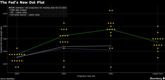
(Bloomberg) -- The Federal Reserve’s so-called dot plot, which the U.S. central bank uses to signal its outlook for the path of interest rates, shows that policy makers expect two more rate increases in 2018, based on median estimates. The Fed on Wednesday raised its benchmark rate for the second time this year.
To contact the reporter on this story: Sophie Caronello in Washington at scaronello@bloomberg.net
To contact the editors responsible for this story: Cesca Antonelli at fantonelli@bloomberg.net, Vince Golle
©2018 Bloomberg L.P.