These Are the Charts That Scare Wall Street
October horror show is nearly over but plenty of worry remains.

(Bloomberg) -- Halloween’s here and for investors, October has been all trick and no treat.
The S&P 500’s decision to dress up like Niagara Falls for the holiday isn’t the only scary sight across global markets, according to analysts.
A compilation of Wall Street’s ghoulish graphs showcases concern about the impact of rising rates, the longevity of the U.S. business cycle, the state of the world’s second-largest economy, and the current swoon in stocks. Here are the charts that give the professionals nightmares.
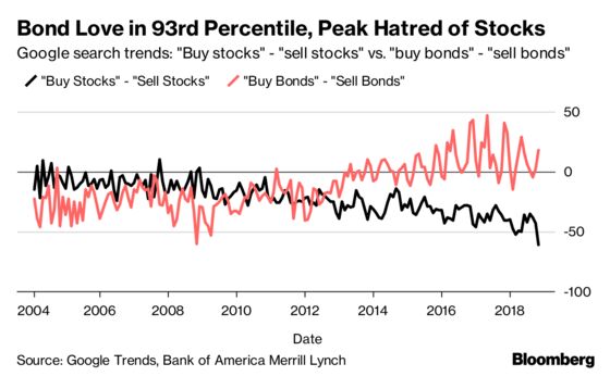
Jill Carey Hall, Equity Strategist at BofAML:
“Stocks are more hated than ever, but there’s no fear of bonds: Despite the fact that we may be exiting a 30+ year bull market in bonds, with rates having risen demonstrably, there is no clear negative sentiment toward bonds. The attached chart shows one measure of investors’ sanguine view on bonds based on Google search trends, where bonds are a far riskier asset class today, in our view.”
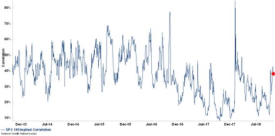
Mandy Xu, Chief Equity Derivatives Strategist at Credit Suisse:
‘‘For ‘scary’ charts, I nominate the following chart on SPX correlation. Basically, the fact it hasn’t moved in this sell-off indicate the stress is still very isolated to Tech/crowded names and not yet systemic. Low correlation is what’s keeping VIX tame. But if this were to turn, we should see much higher levels of vol and vol-of-vol.”
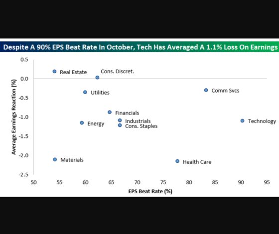
George Pearkes, Macro Strategist at Bespoke Investment Group:“Tech has been a huge outperformer across the history of this bull market, so to see the sector performing so well from an earnings perspective but so poorly from a market reaction perspective is a good way to spook investors.”
“Tech has been a huge outperformer across the history of this bull market, so to see the sector performing so well from an earnings perspective but so poorly from a market reaction perspective is a good way to spook investors.”
Ed Al-Hussainy, Senior Analyst at Columbia Threadneedle:
“Over the past 18 months, we have seen only a marginal tightening in financial conditions -- particularly credit spreads and equities -- in response to rising front-end rates. This has left risk markets vulnerable to a sharper, disorderly correction.”
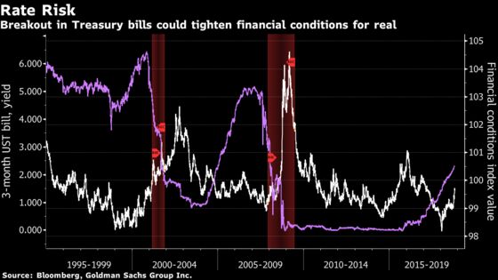
“We tripped a pain threshold for emerging markets earlier this year when two-year Treasury yields broke 2 percent. As we approach 2019, the resilience of a broader set of risk assets to rising yields is being tested. Many will be found wanting.”
Aleksandar Kocic, Head of U.S. Rates Strategy at Deutsche Bank:“Under normal market conditions, equity-rates correlations tend to be positive. Either we have a recession where bonds rally and stocks sell-off or a recovery with a rally in stocks and sell-off in bonds. However, in the post 2008 recession, the traditional stimulus, which forces this portfolio rebalancing, was not sufficient. The additional measures of liquidity injection created conditions where both stocks and bonds performed well. And nobody complained because there was nothing to complain about. We were seduced by correlations.”
“This was good while it lasted, but the obvious problems would arise when we face the prospects of unwinding stimulus and reversal of the QE mode. The inertia of that unwind would push the markets naturally from rally in stocks and bonds to sell-off in both assets. This is the ‘fatal attraction’ of correlations, a scenario to which there is no adequate monetary policy response.”
“Under normal market conditions, equity-rates correlations tend to be positive. Either we have a recession where bonds rally and stocks sell-off or a recovery with a rally in stocks and sell-off in bonds. However, in the post 2008 recession, the traditional stimulus, which forces this portfolio rebalancing, was not sufficient. The additional measures of liquidity injection created conditions where both stocks and bonds performed well. And nobody complained because there was nothing to complain about. We were seduced by correlations.”
“This was good while it lasted, but the obvious problems would arise when we face the prospects of unwinding stimulus and reversal of the QE mode. The inertia of that unwind would push the markets naturally from rally in stocks and bonds to sell-off in both assets. This is the ‘fatal attraction’ of correlations, a scenario to which there is no adequate monetary policy response.”
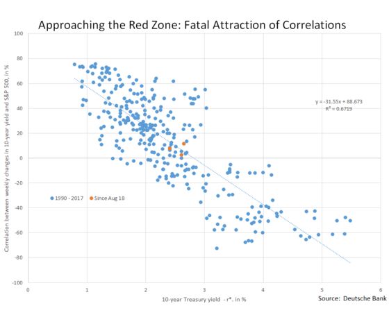
“The implication is that the ‘red zone’ for the change in correlation is a range from roughly 3.20 percent to 3.70 percent 10-year Treasury yields.”
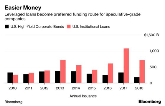
Peter Tchir, Head of Macro Strategy at Academy Securities:“The amount of leveraged loans outstanding is now larger than the amount of high yield bonds outstanding. They tend to be less transparent and have weaker price discovery -- which is why I care so much. You can watch high yield as much as you want, but if there is a credit problem, the epicenter will be the leveraged loan market.”
“The implication is that the ‘red zone’ for the change in correlation is a range from roughly 3.20 percent to 3.70 percent 10-year Treasury yields.”
“The implication is that the ‘red zone’ for the change in correlation is a range from roughly 3.20 percent to 3.70 percent 10-year Treasury yields.”
Peter Tchir, Head of Macro Strategy at Academy Securities:“The amount of leveraged loans outstanding is now larger than the amount of high yield bonds outstanding. They tend to be less transparent and have weaker price discovery -- which is why I care so much. You can watch high yield as much as you want, but if there is a credit problem, the epicenter will be the leveraged loan market.”
“The amount of leveraged loans outstanding is now larger than the amount of high yield bonds outstanding. They tend to be less transparent and have weaker price discovery -- which is why I care so much. You can watch high yield as much as you want, but if there is a credit problem, the epicenter will be the leveraged loan market.”
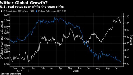
Priya Misra, Head of Global Rates Strategy at TD Securities:“CNH suggests that Chinese growth is slowing, while 10-year real rates suggest that U.S. real rates are rising. Can the U.S. handle higher real rates with global growth decelerating? One of these markets has it terribly wrong…”
Priya Misra, Head of Global Rates Strategy at TD Securities:“CNH suggests that Chinese growth is slowing, while 10-year real rates suggest that U.S. real rates are rising. Can the U.S. handle higher real rates with global growth decelerating? One of these markets has it terribly wrong…”
“CNH suggests that Chinese growth is slowing, while 10-year real rates suggest that U.S. real rates are rising. Can the U.S. handle higher real rates with global growth decelerating? One of these markets has it terribly wrong…”
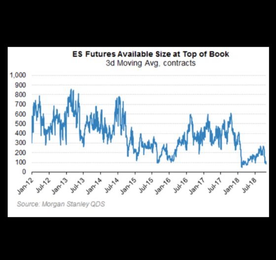
Matt Rowe, CIO at Headwaters Solutions
“Stocks are the most liquid and getting hit first...and by the way liquidity stinks. High yield and real estate are next and liquidity for price drop selling is wildly scarce. This is scary!”
Matt Rowe, CIO at Headwaters Solutions
“Stocks are the most liquid and getting hit first...and by the way liquidity stinks. High yield and real estate are next and liquidity for price drop selling is wildly scarce. This is scary!”
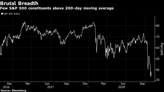
Mayank Seksaria, Chief Macro Strategist at Macro Risk Advisors:“Breadth is much weaker than the February drawdown and thus internals are much weaker. We believe that it will take more -- either positive catalysts or further lower prices -- to turn the sentiment around.”
Mayank Seksaria, Chief Macro Strategist at Macro Risk Advisors:“Breadth is much weaker than the February drawdown and thus internals are much weaker. We believe that it will take more -- either positive catalysts or further lower prices -- to turn the sentiment around.”
“Breadth is much weaker than the February drawdown and thus internals are much weaker. We believe that it will take more -- either positive catalysts or further lower prices -- to turn the sentiment around.”
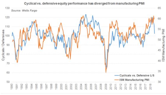
Pravit Chintawongvanich, Derivatives Strategist at Wells Fargo:“Cyclical versus defensive equity performance has historically moved tightly with economic activity. The recent underperformance predicts a significant economic slowdown that hasn’t yet hit the data. Taken by itself, this is a highly worrying signal. However, the resilience of credit markets and under-reaction in equity volatility suggests that this is primarily an equity unwind rather than a broader macro event. The underperformance among active equity investors (equity long/short funds are having their worst month since August 2011) corroborates this.”
Pravit Chintawongvanich, Derivatives Strategist at Wells Fargo:“Cyclical versus defensive equity performance has historically moved tightly with economic activity. The recent underperformance predicts a significant economic slowdown that hasn’t yet hit the data. Taken by itself, this is a highly worrying signal. However, the resilience of credit markets and under-reaction in equity volatility suggests that this is primarily an equity unwind rather than a broader macro event. The underperformance among active equity investors (equity long/short funds are having their worst month since August 2011) corroborates this.”
“Cyclical versus defensive equity performance has historically moved tightly with economic activity. The recent underperformance predicts a significant economic slowdown that hasn’t yet hit the data. Taken by itself, this is a highly worrying signal. However, the resilience of credit markets and under-reaction in equity volatility suggests that this is primarily an equity unwind rather than a broader macro event. The underperformance among active equity investors (equity long/short funds are having their worst month since August 2011) corroborates this.”
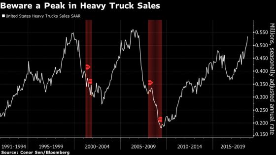
Conor Sen, Portfolio Manager at New River Investments:
“In the last two cycles, heavy truck sales peaked around 18 months before recession. They’re currently surging and approaching prior cycle highs. If a peak is imminent, what does that mean for the duration of the expansion?”
Conor Sen, Portfolio Manager at New River Investments:
“In the last two cycles, heavy truck sales peaked around 18 months before recession. They’re currently surging and approaching prior cycle highs. If a peak is imminent, what does that mean for the duration of the expansion?”
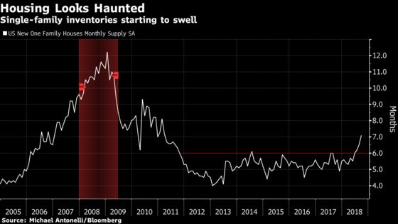
Michael Antonelli, Equity Sales Trader at Robert W. Baird & Co.:“New home sales are a fantastic leading indicator and it looks like they have cracked. Inventories are starting to pile up and with the Fed on a ‘hike until we break something’ course, this chart is scarier than a cocktail party at the Overlook Hotel.”
Michael Antonelli, Equity Sales Trader at Robert W. Baird & Co.:“New home sales are a fantastic leading indicator and it looks like they have cracked. Inventories are starting to pile up and with the Fed on a ‘hike until we break something’ course, this chart is scarier than a cocktail party at the Overlook Hotel.”
“New home sales are a fantastic leading indicator and it looks like they have cracked. Inventories are starting to pile up and with the Fed on a ‘hike until we break something’ course, this chart is scarier than a cocktail party at the Overlook Hotel.”
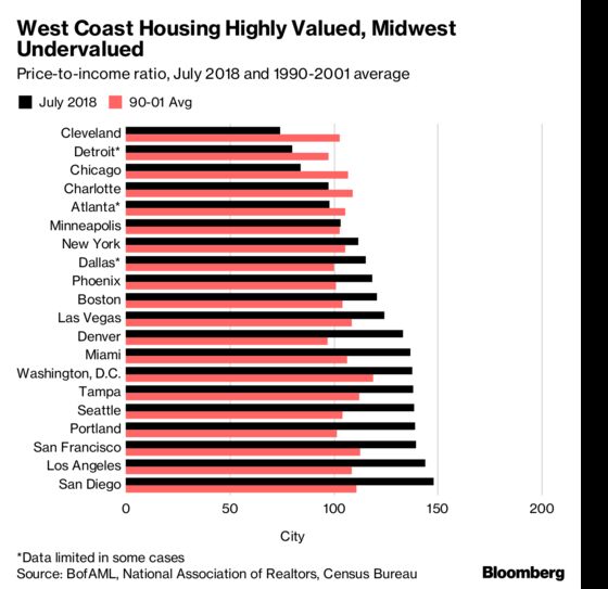
Michelle Meyer, Head of U.S. Economics at BofAML:
"The below chart shows that the majority of the major metropolitan areas are seeing home prices that are high relative to the historical relationship between income and prices. In other words, prices are running above measures of ’fair value.’ The stark difference is between the highly valued West Coast and the lower valued Midwest. The scary question is: how sustainable is this trend?"
Kit Juckes, Chief Currency Strategist at Societe Generale:“What if the Chinese yuan -- rather than the dollar -- is now the most important currency in the world even if it isn’t about to become the most traded, or the favorite in which to denominate trade, wealth or reserves?”
“Conventional wisdom has it that the dollar peaked against the euro at end of 2016 because that was the peak of fear about Marine Le Pen winning the French presidential election. So it’s seen as just a coincidence that this was also exactly when the USD/CNY rate peaked and China intervened to stop the currency’s decline. Likewise, EUR/USD peaked in the first quarter at the same time as the CNY recovery ran out of steam.”
“What if the Chinese yuan -- rather than the dollar -- is now the most important currency in the world even if it isn’t about to become the most traded, or the favorite in which to denominate trade, wealth or reserves?”
“Conventional wisdom has it that the dollar peaked against the euro at end of 2016 because that was the peak of fear about Marine Le Pen winning the French presidential election. So it’s seen as just a coincidence that this was also exactly when the USD/CNY rate peaked and China intervened to stop the currency’s decline. Likewise, EUR/USD peaked in the first quarter at the same time as the CNY recovery ran out of steam.”
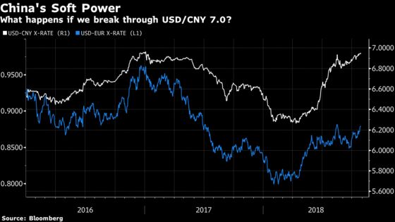
“At the very least, we are now in a three-currency system. And of the central banks at the heart of the global currency market, the Fed and the ECB overload us with forward guidance -- while the PBoC does just the opposite.”
Ben Emons, Chief Economist at Intellectus Partners LLC:“Japanese interest rates are the most artificially low in the developed markets. The Bank of Japan’s negative interest rate, yield-curve control and quantitative easing have pinned down bond yields to unsustainable levels.”
“Japanese interest rates are the most artificially low in the developed markets. The Bank of Japan’s negative interest rate, yield-curve control and quantitative easing have pinned down bond yields to unsustainable levels.”
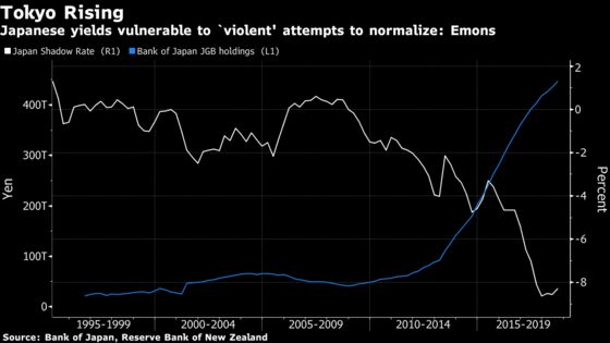
“As a result, Japan’s shadow-policy rate -- the zero-bound benchmark adjusted for the impact of quantitative easing -- is at an historic divergence from the U.S. Even though Japanese inflation is low, it is no longer weak and the threat of deflation has diminished. Japanese yields are most prone to violent attempts to normalize.”
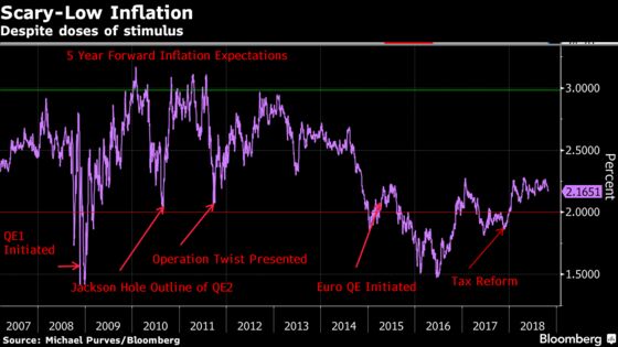
Michael Purves, Chief Global Strategist at Weeden & Co.:
“I think the chart below tells an interesting story about how stubborn structural disinflation has failed to accelerate despite a lot of QE and now a lot of fiscal stimulus. Given aggregate debt levels continue to rise, the ability of governments to deflate their real liabilities which arguably puts central banks on their back (dovish) foot. If there is a new normal for inflation, that may well continue to exacerbate wealth disparity.”
“As a result, Japan’s shadow-policy rate -- the zero-bound benchmark adjusted for the impact of quantitative easing -- is at an historic divergence from the U.S. Even though Japanese inflation is low, it is no longer weak and the threat of deflation has diminished. Japanese yields are most prone to violent attempts to normalize.”
“As a result, Japan’s shadow-policy rate -- the zero-bound benchmark adjusted for the impact of quantitative easing -- is at an historic divergence from the U.S. Even though Japanese inflation is low, it is no longer weak and the threat of deflation has diminished. Japanese yields are most prone to violent attempts to normalize.”
Michael Purves, Chief Global Strategist at Weeden & Co.:
“I think the chart below tells an interesting story about how stubborn structural disinflation has failed to accelerate despite a lot of QE and now a lot of fiscal stimulus. Given aggregate debt levels continue to rise, the ability of governments to deflate their real liabilities which arguably puts central banks on their back (dovish) foot. If there is a new normal for inflation, that may well continue to exacerbate wealth disparity.”
Tina Fordham, Chief Political Analyst at Citigroup Inc.:“A Pew study identifying the difference between fact and opinion in the U.S. is particularly relevant as we head into the midterm elections as well as highlighting broader themes of declining trust in institutions, political polarization and the advent of ‘fake news.’”
Tina Fordham, Chief Political Analyst at Citigroup Inc.:“A Pew study identifying the difference between fact and opinion in the U.S. is particularly relevant as we head into the midterm elections as well as highlighting broader themes of declining trust in institutions, political polarization and the advent of ‘fake news.’”
Tina Fordham, Chief Political Analyst at Citigroup Inc.:“A Pew study identifying the difference between fact and opinion in the U.S. is particularly relevant as we head into the midterm elections as well as highlighting broader themes of declining trust in institutions, political polarization and the advent of ‘fake news.’”
“A Pew study identifying the difference between fact and opinion in the U.S. is particularly relevant as we head into the midterm elections as well as highlighting broader themes of declining trust in institutions, political polarization and the advent of ‘fake news.’”
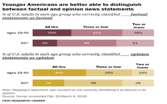
“If a significant proportion of the U.S. public cannot distinguish between fact and opinion, is democracy in trouble? For many elections to come, we are likely in for more ‘alternative facts,’ an outcome market participants may find at odds with the cherished notion that people vote in their economic self-interest.”
“If a significant proportion of the U.S. public cannot distinguish between fact and opinion, is democracy in trouble? For many elections to come, we are likely in for more ‘alternative facts,’ an outcome market participants may find at odds with the cherished notion that people vote in their economic self-interest.”
“If a significant proportion of the U.S. public cannot distinguish between fact and opinion, is democracy in trouble? For many elections to come, we are likely in for more ‘alternative facts,’ an outcome market participants may find at odds with the cherished notion that people vote in their economic self-interest.”
“If a significant proportion of the U.S. public cannot distinguish between fact and opinion, is democracy in trouble? For many elections to come, we are likely in for more ‘alternative facts,’ an outcome market participants may find at odds with the cherished notion that people vote in their economic self-interest.”
--With assistance from Sarah Ponczek.
To contact the reporters on this story: Luke Kawa in Toronto at lkawa@bloomberg.net;Sid Verma in London at sverma100@bloomberg.net
To contact the editors responsible for this story: Samuel Potter at spotter33@bloomberg.net, Cecile Gutscher
©2018 Bloomberg L.P.
--With assistance from Sarah Ponczek.
To contact the reporters on this story: Luke Kawa in Toronto at lkawa@bloomberg.net;Sid Verma in London at sverma100@bloomberg.net
To contact the editors responsible for this story: Samuel Potter at spotter33@bloomberg.net, Cecile Gutscher
©2018 Bloomberg L.P.
--With assistance from Sarah Ponczek.
To contact the reporters on this story: Luke Kawa in Toronto at lkawa@bloomberg.net;Sid Verma in London at sverma100@bloomberg.net
To contact the editors responsible for this story: Samuel Potter at spotter33@bloomberg.net, Cecile Gutscher
©2018 Bloomberg L.P.